Growing Up with Liam’s Room
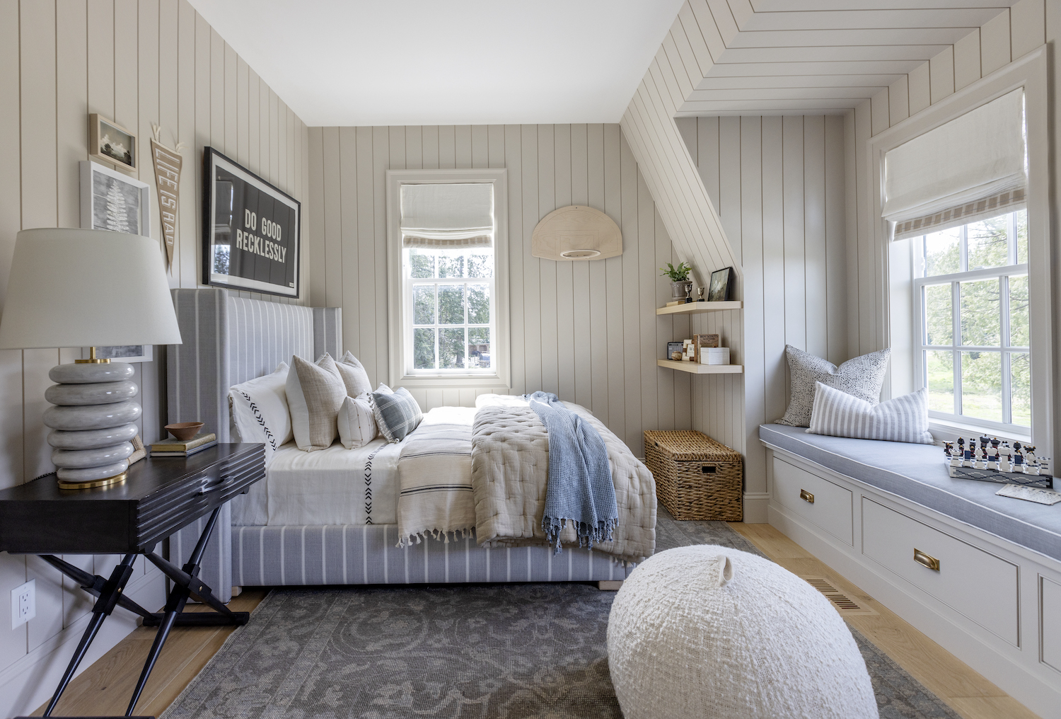
Welcome to Liam’s room! I’m thrilled to finally share Liam’s room with you all! A room that I’ve been excited to work on, especially because he’s growing up before our eyes and I wanted a space he could enjoy and love for the years to come as he grows. You might remember me sharing his sweet nursery and nautical big boy room over the years. A fun way to look back with the progression of a growing boy… from crib to single bed and now a room with a double bed to last for the years to come!
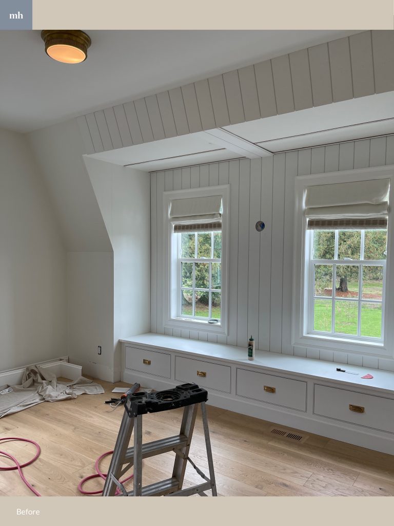
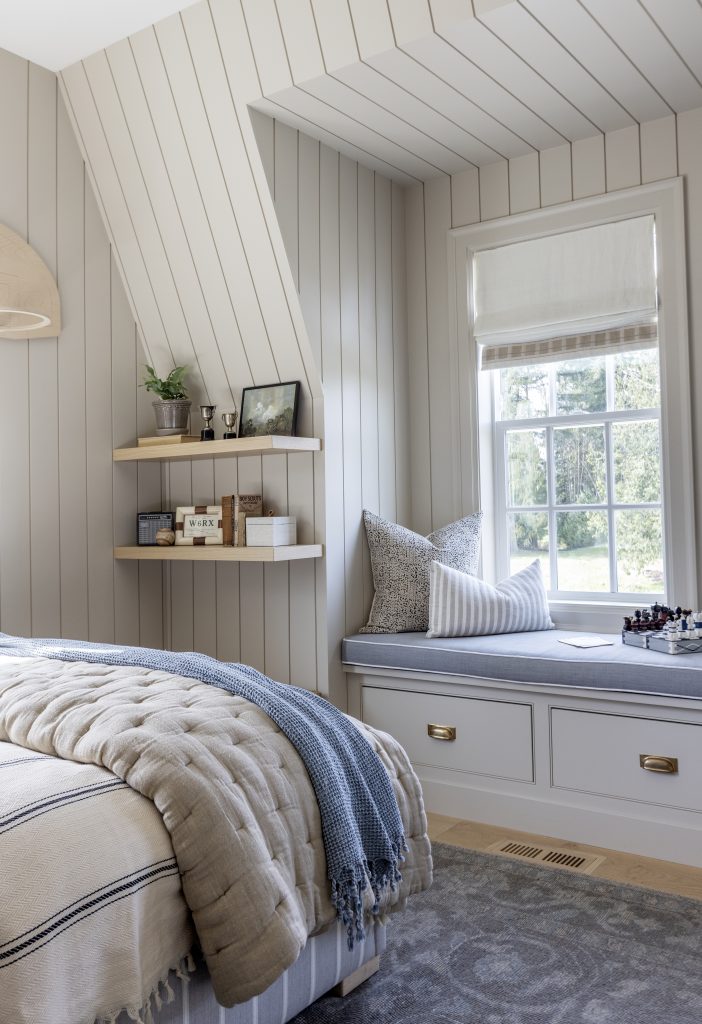
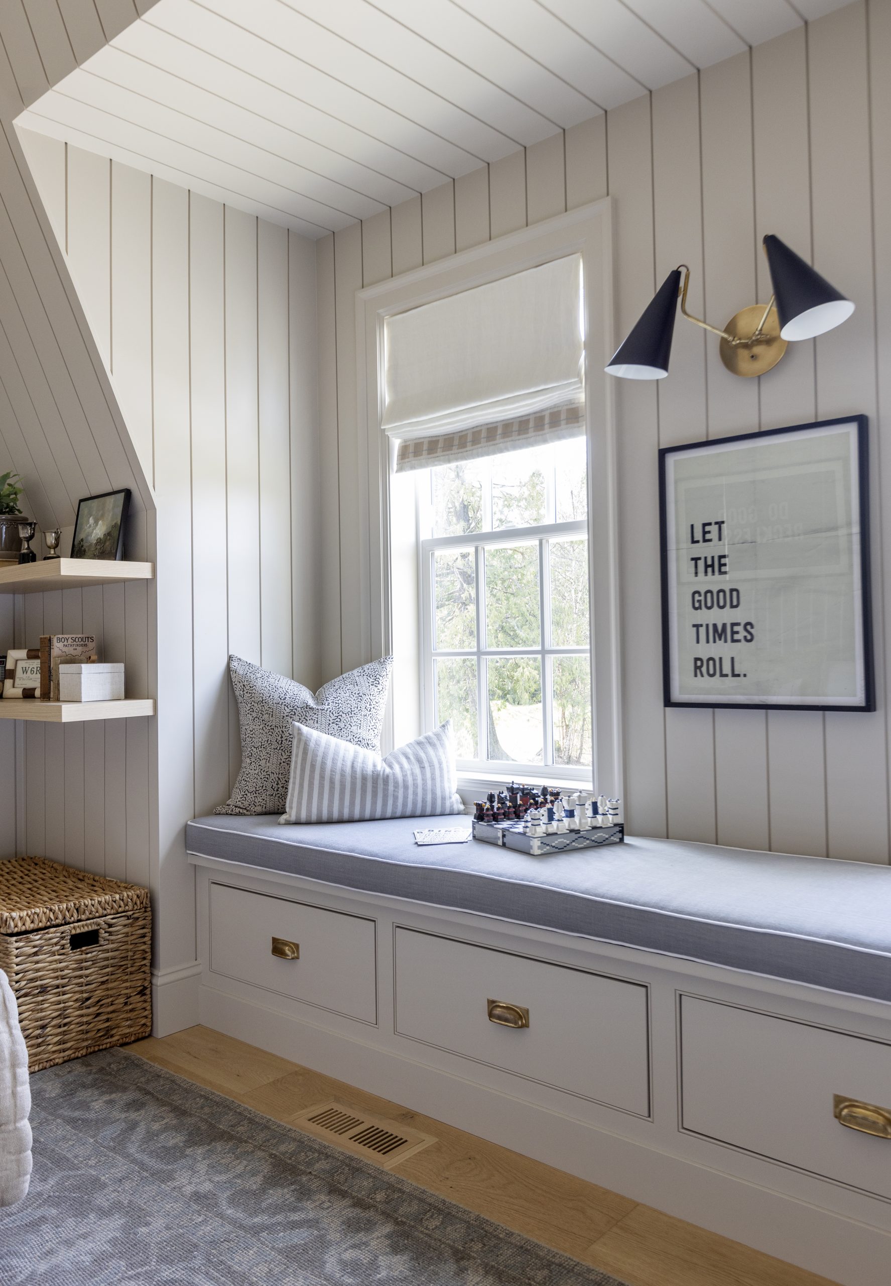
Since moving into our home, I held off on finishing the space for a little while to make sure I could dedicate enough time to the unique features in the room. Such as the the slanted ceiling and window seat that proved to be a bit of a challenge with both finishing and design. Ultimately, I wanted to work with these features, not against them, so we decided to install shiplap panelling throughout his room for visual interest and added character. Once that was done, the next big step was painting.
For styling a young boy’s room, I knew I wanted colour on the walls. Something darker that Liam can grow into, but not too dark that it changed the feel of the room. Comfortable and calming was my goal. Accessible Beige SW 7036 from the Sherwin-Williams Living Well™ collection was one of the paint colors at the top of my list as it’s a much-loved colour by many.
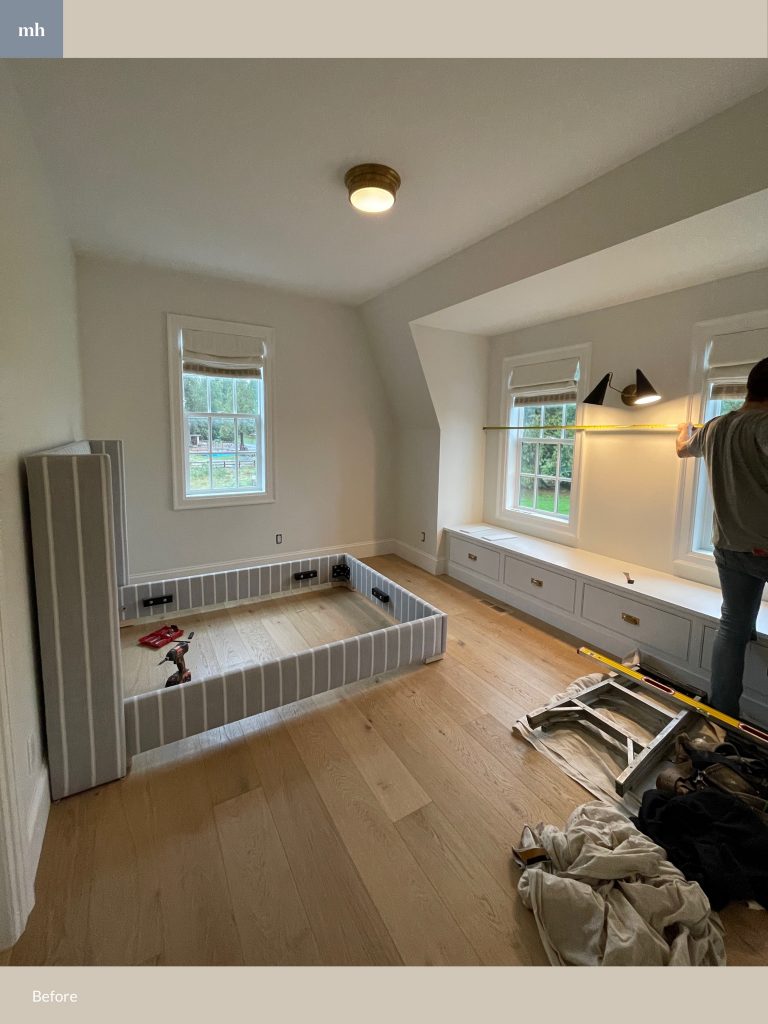
Below you’ll see some before photos before we installed the shiplap panelling and before paint too.
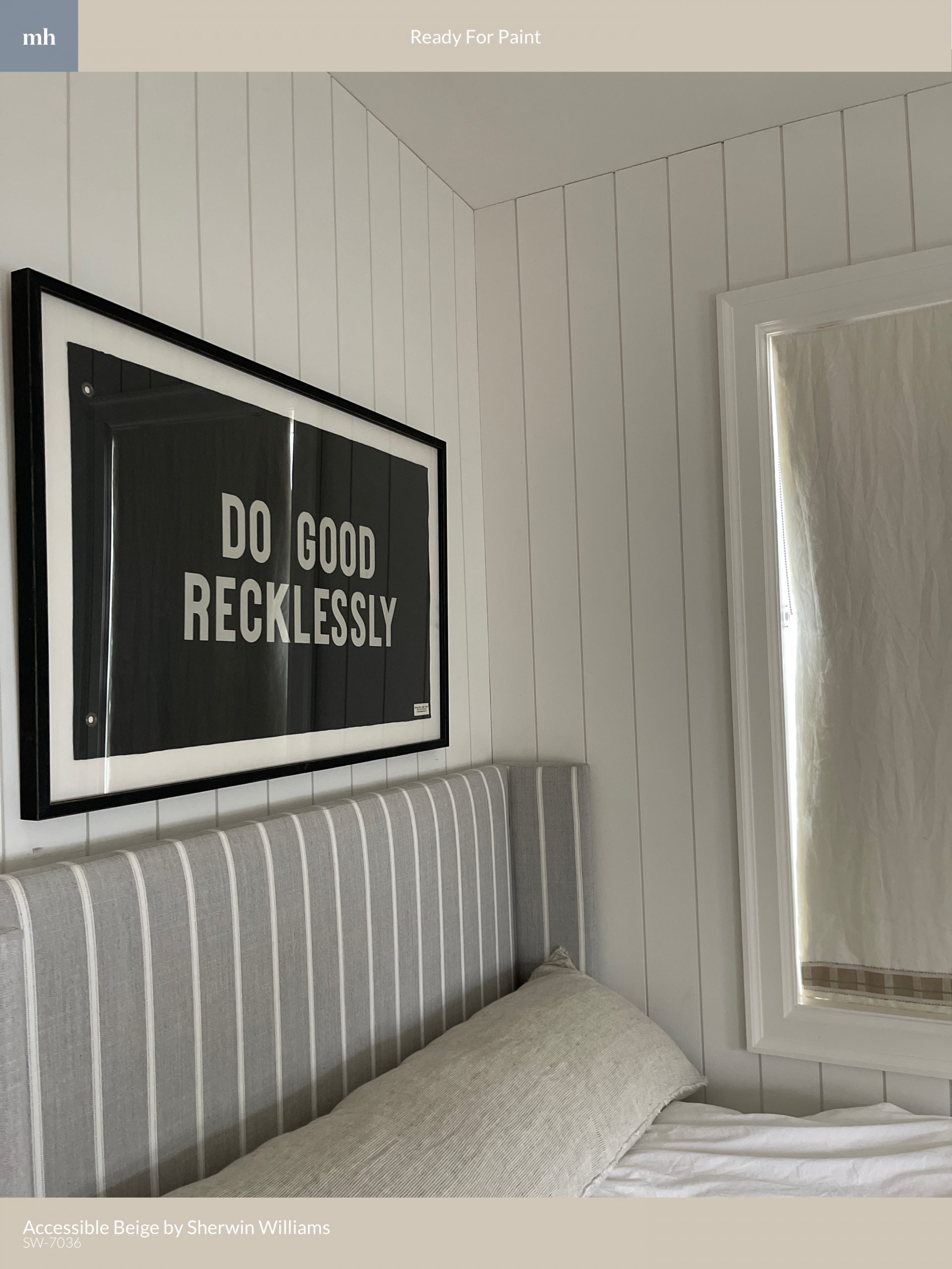
The paint is SuperPaint® with Air Purifying Technology, which was launched with the Living Well collection and helps support well-being by improving indoor air quality and reducing odours. The product and colour really come together to create a fresh space for Liam.
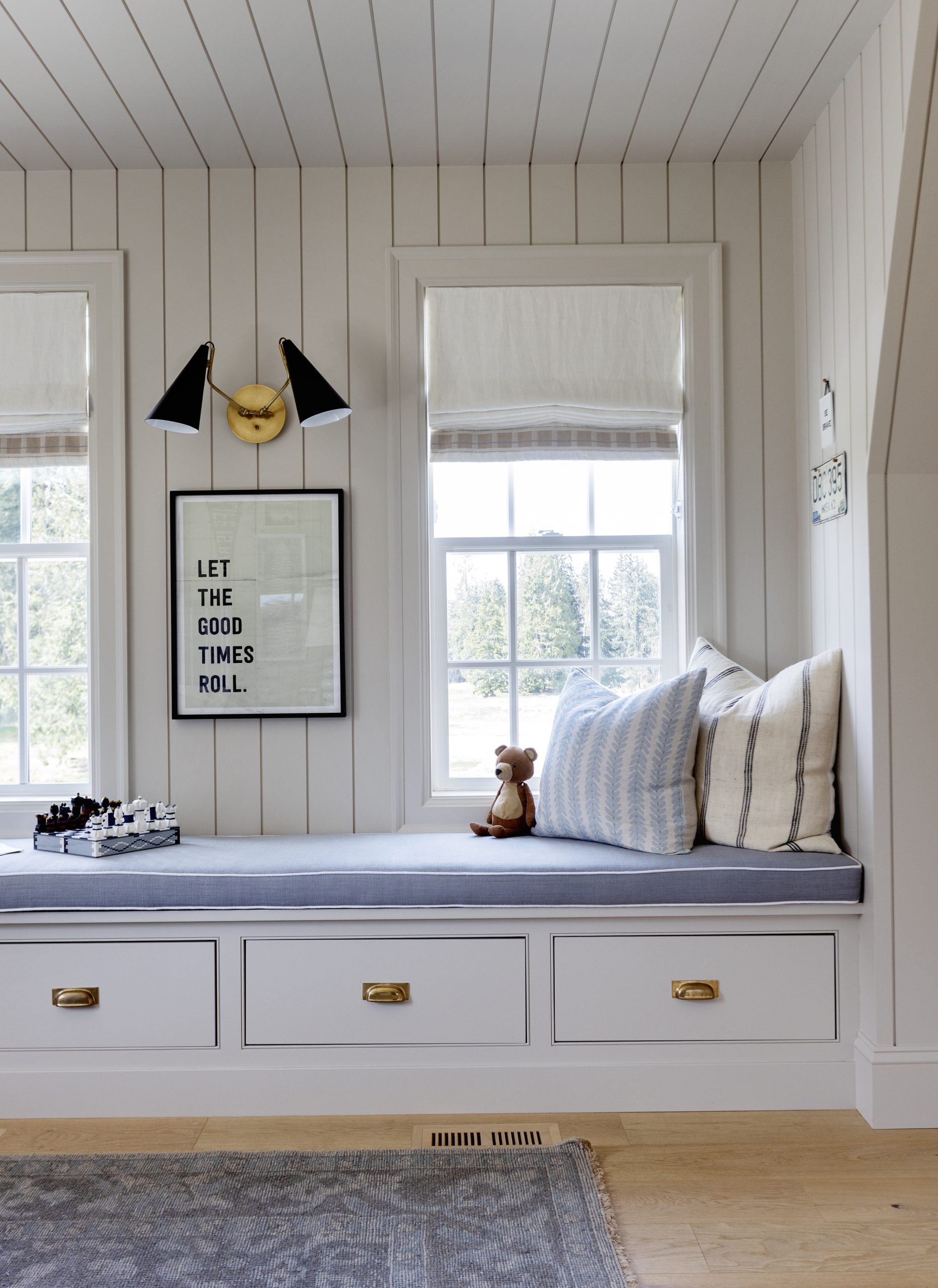
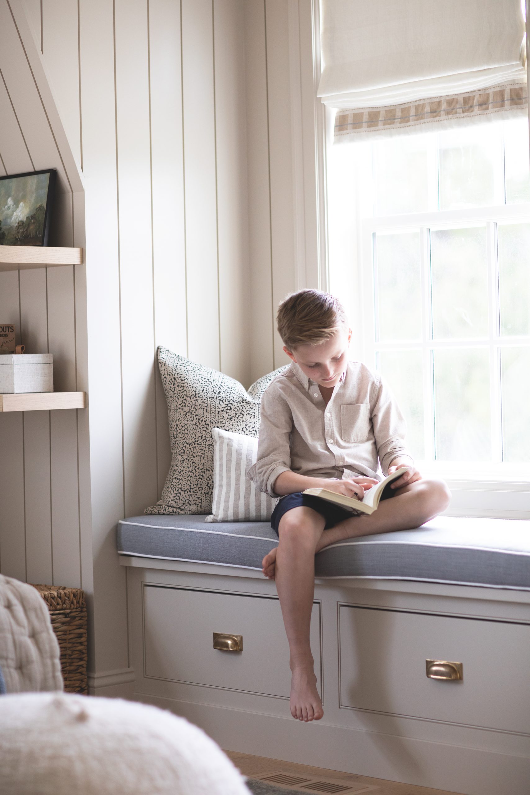
We ended up painting not only the panelling in the room, but also the window trim, baseboards, bench seat builtin, window casing, and doors—all in Accessible Beige SW 7036. The custom roman shades also have a matching coloured band on the bottom to tie into the paint colour. (The only area we didn’t paint was the ceiling.) This definitely gave the room a more dramatic look while still staying true to a neutral tone. Surprisingly, it didn’t darken the room at all, it actually brought life to the room. We are so thrilled with how it turned out, including Liam!
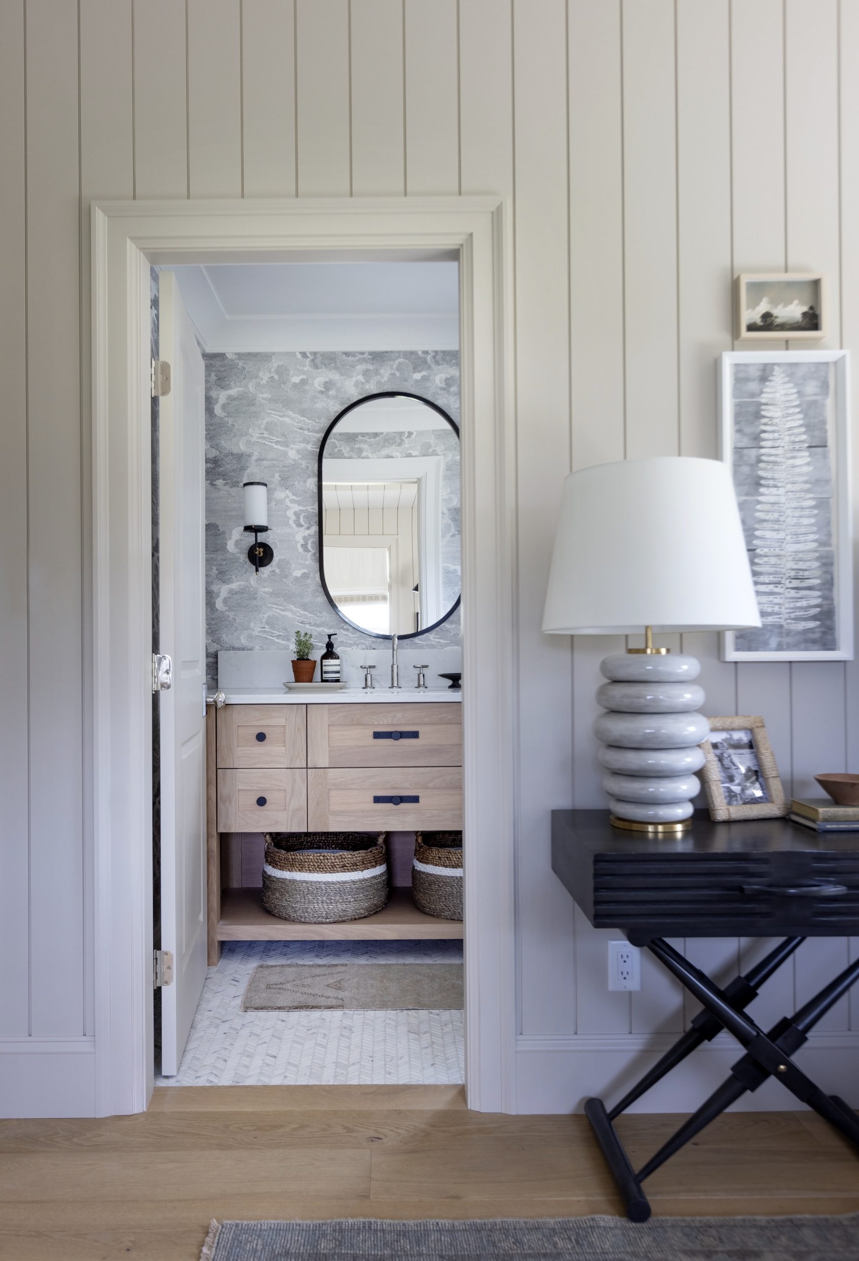
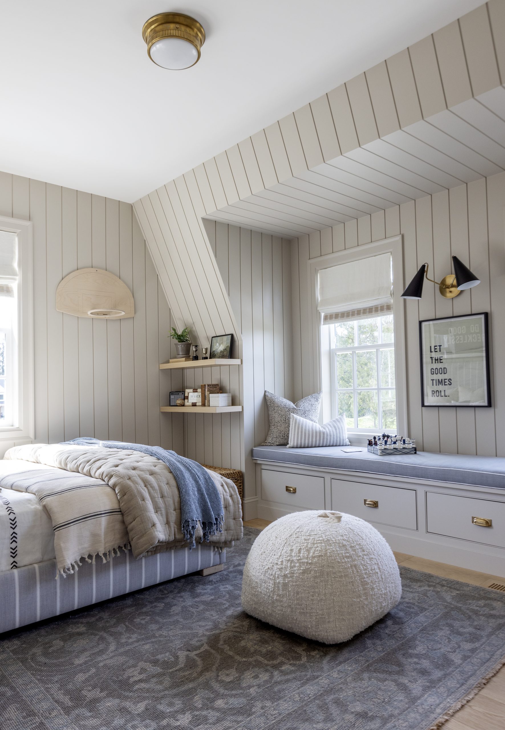
Wall colour really holds the key to the mood and tone of a room. Since I started with a colour already in mind, we purposefully designed the space around the colour making sure everything played off accordingly. However, the advantage of using a neutral and grounding colour like Accessible Beige SW 7036 is how versatile it is: you can use it as a refresh without having to change your décor.
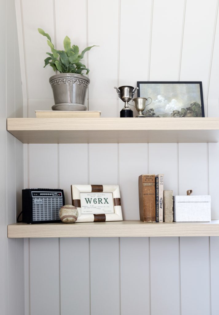
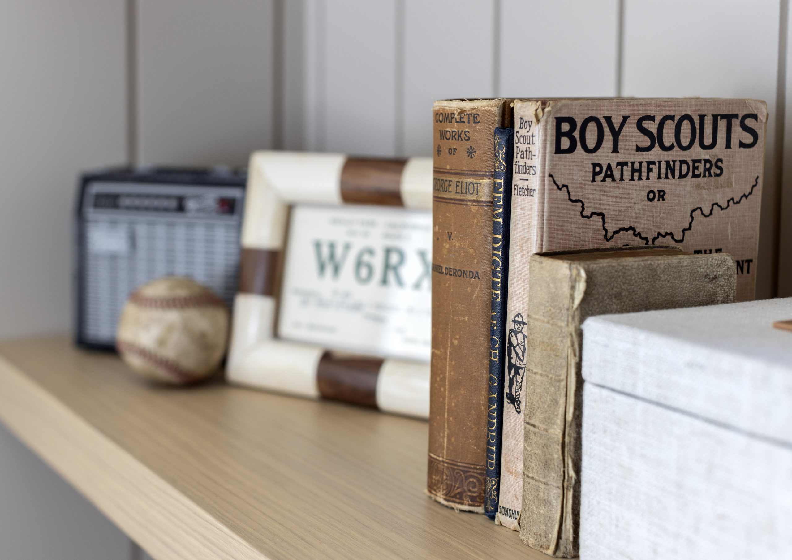
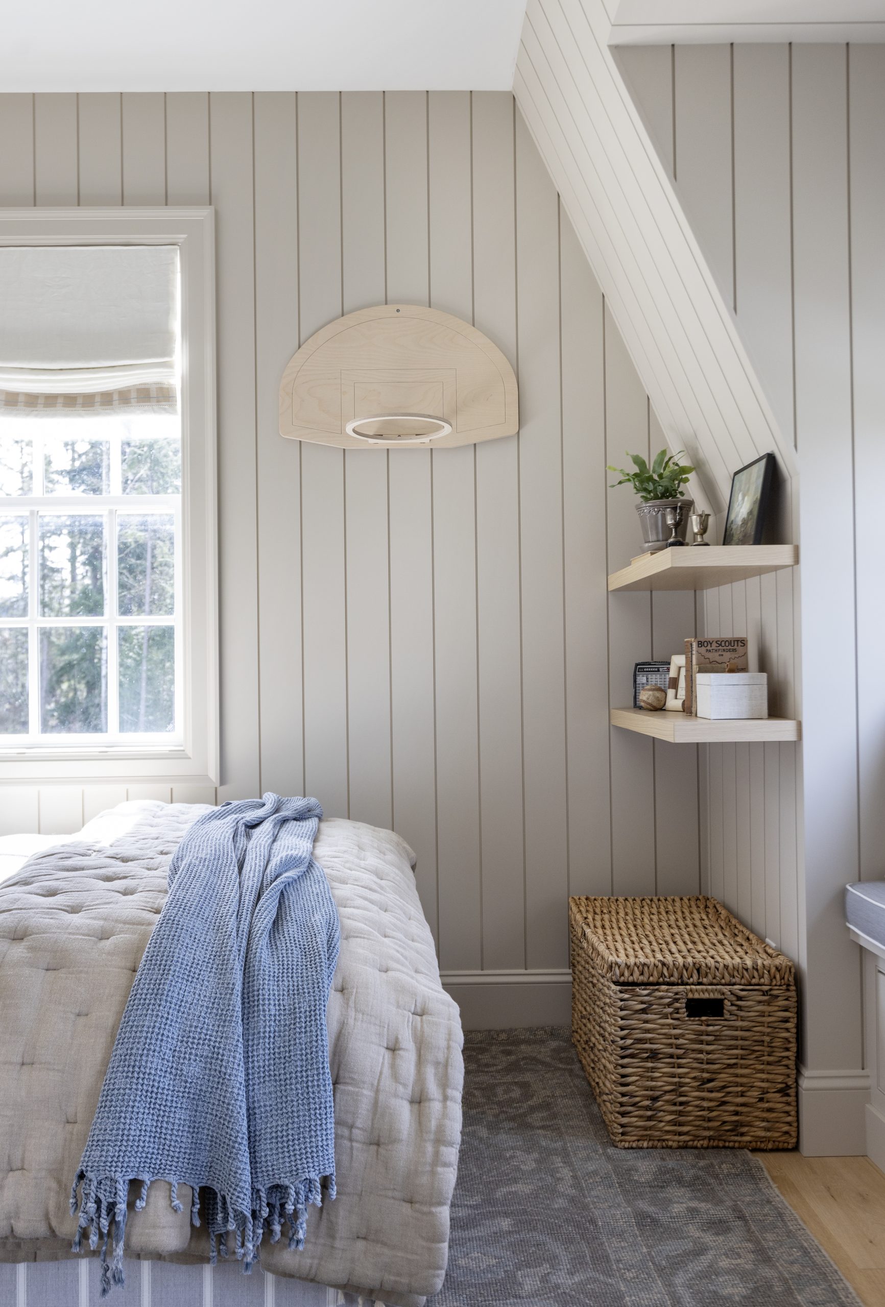
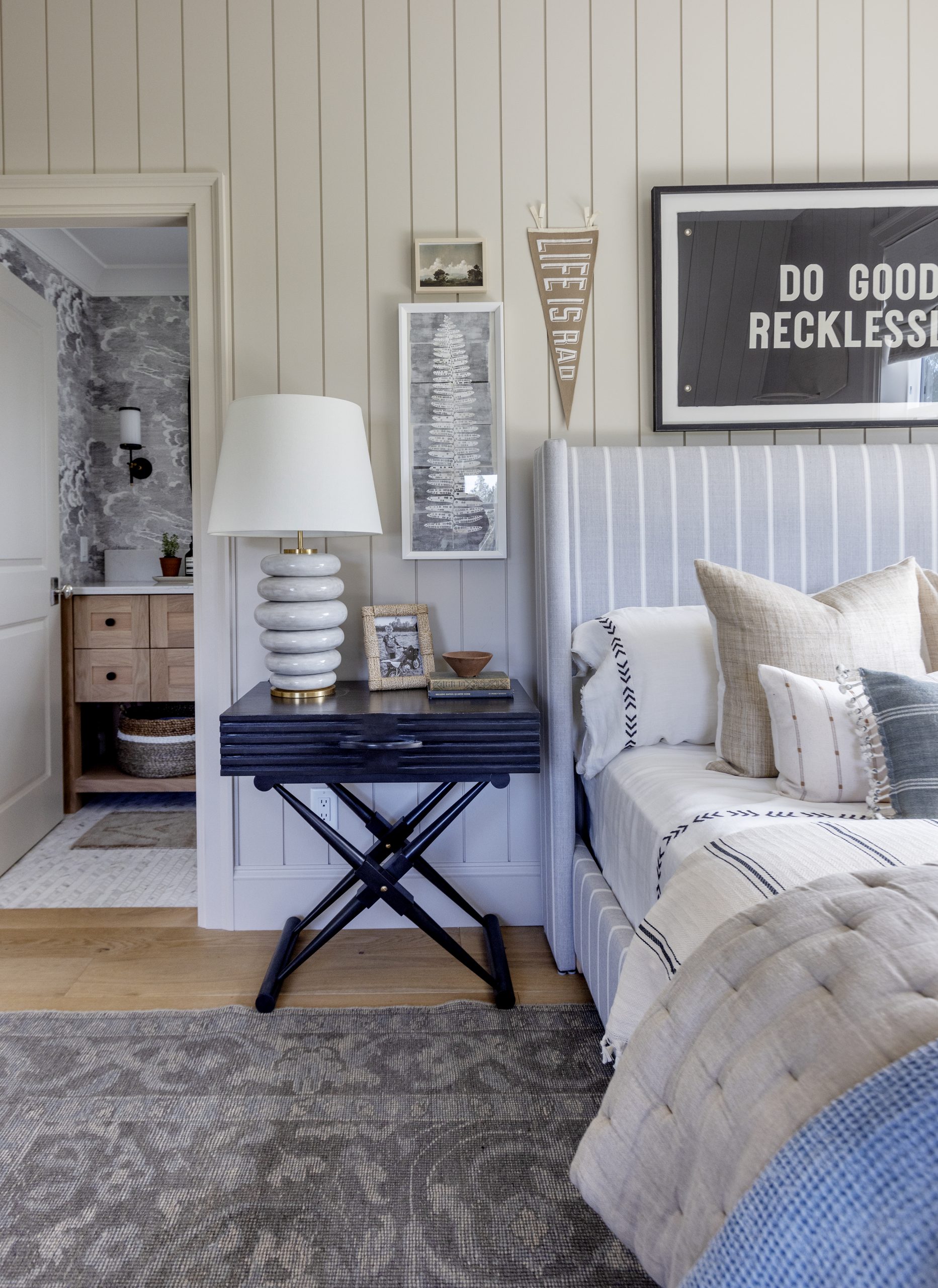 When designing a kid’s room, my advice is to make sure the space feels organized and not too cluttered while still bringing in your child’s interests. A big consideration for me was making sure Liam had enough room for his favourite things. He loves building Lego so I brought in an oversized rug he can work on and two floating shelves where he can display his creations, books, and art. I also made sure Liam was involved in helping pick the colours in his room. I know when kids are involved they tend to go for big and bold colours, but setting parameters can make the process fun while ensuring the room is still cohesive and beautiful. Liam actually helped me choose the blues, black, and grey neutral tones that complement the space. And of course he loves it and feels so proud.

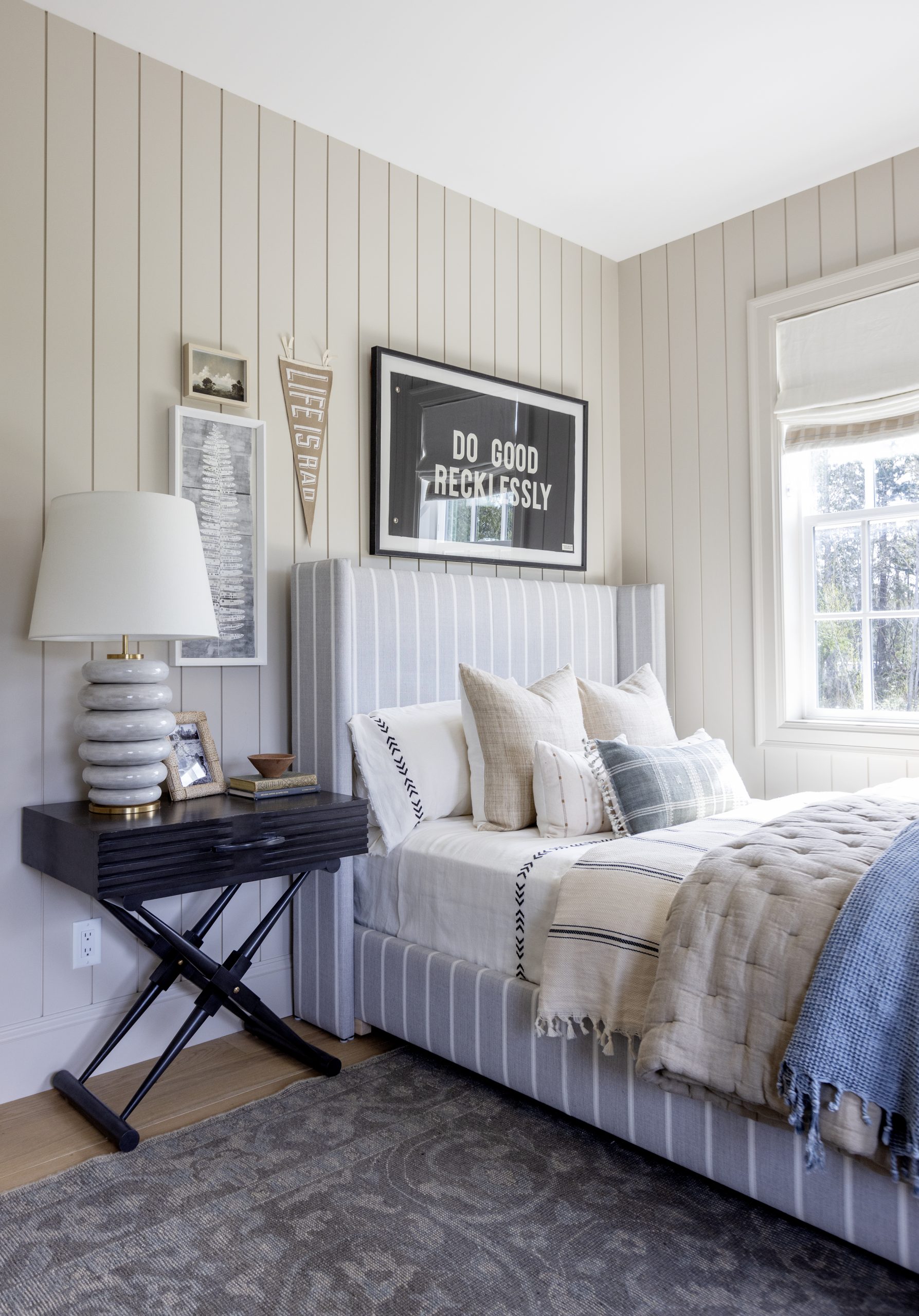
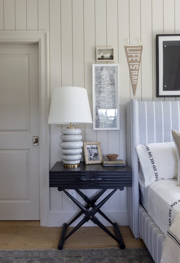
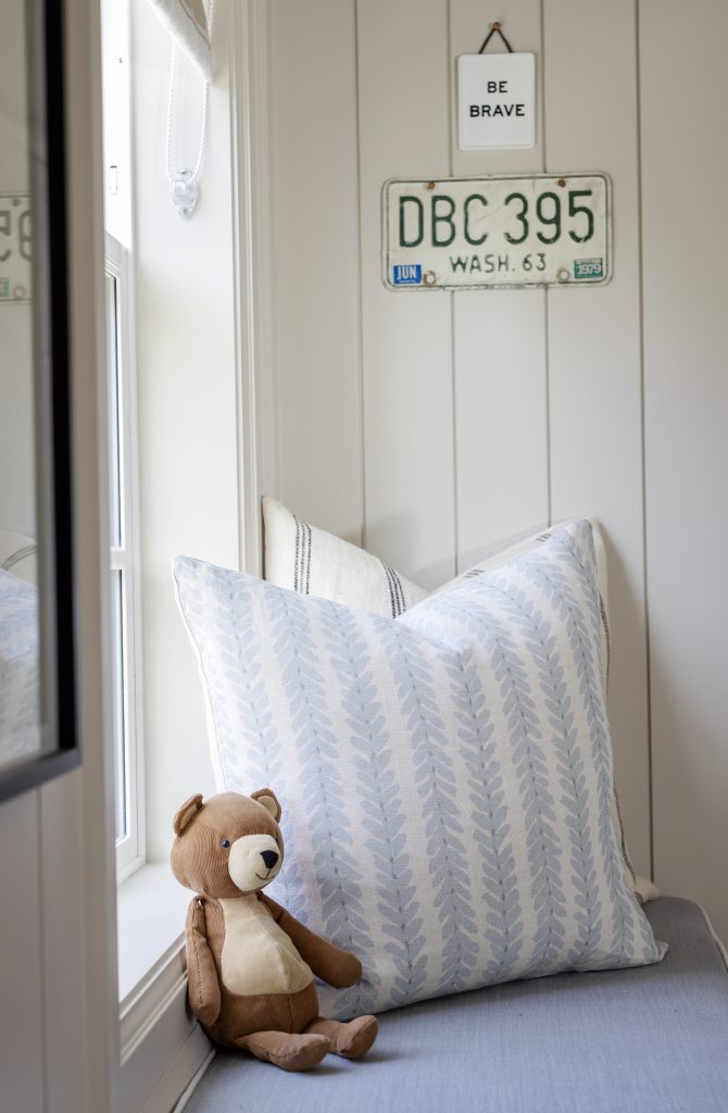
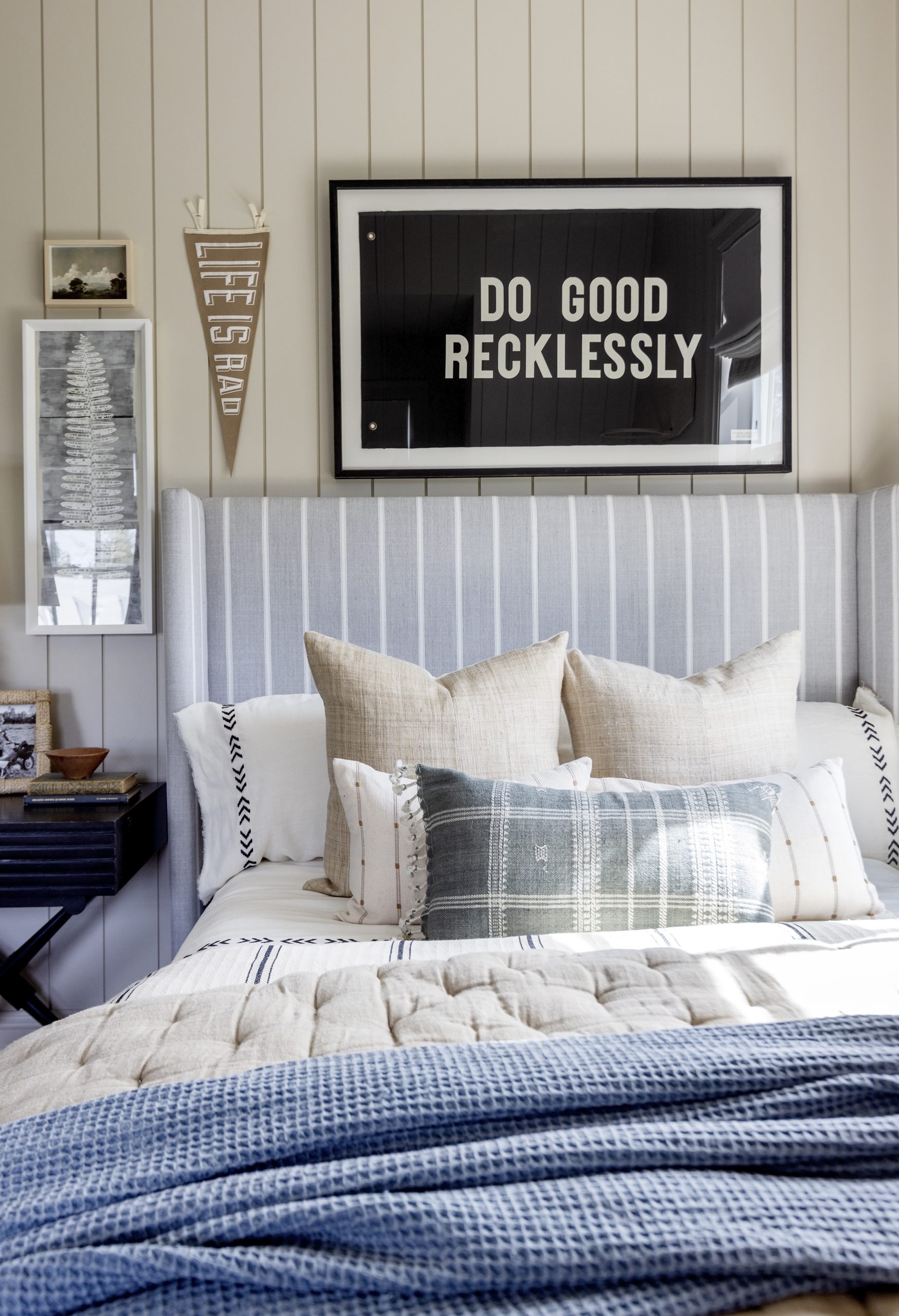
His bed is custom-made through MH Home with a fun classic stripe pattern and lots and lots of bed layers. My tip for a perfect bed is incorporating layered pieces like a throw blanket or quilt over a duvet for a cozy and inviting element. It’s easy enough that Liam can make his own bed, and we added different pillows that he can use on the bed or toss over to his window seat when reading.

Storage is another must in a smaller room. I incorporated extra storage with drawers incorporated into his window bench seat, underneath his shelving tucking in a large lidded basket, his side table, and two baskets tucked under the bathroom vanity.
Bringing in a few vintage-inspired pieces brought character and a more mature feel to the room as Liam grows. Above his bed is a framed pennant flag reading “DO GOOD RECKLESSLY”, hung alongside other art and memorabilia. His lamp, nightstand and rug have a more vintage aesthetic adding more interest.
A cool element that works with the “effortlessly cool kid” theme is the unfinished birch basketball hoop. Our kids have a ton of fun with it, and by using plush balls, there’s no damage to the room! Plus it looks great, an art-like addition to his room.
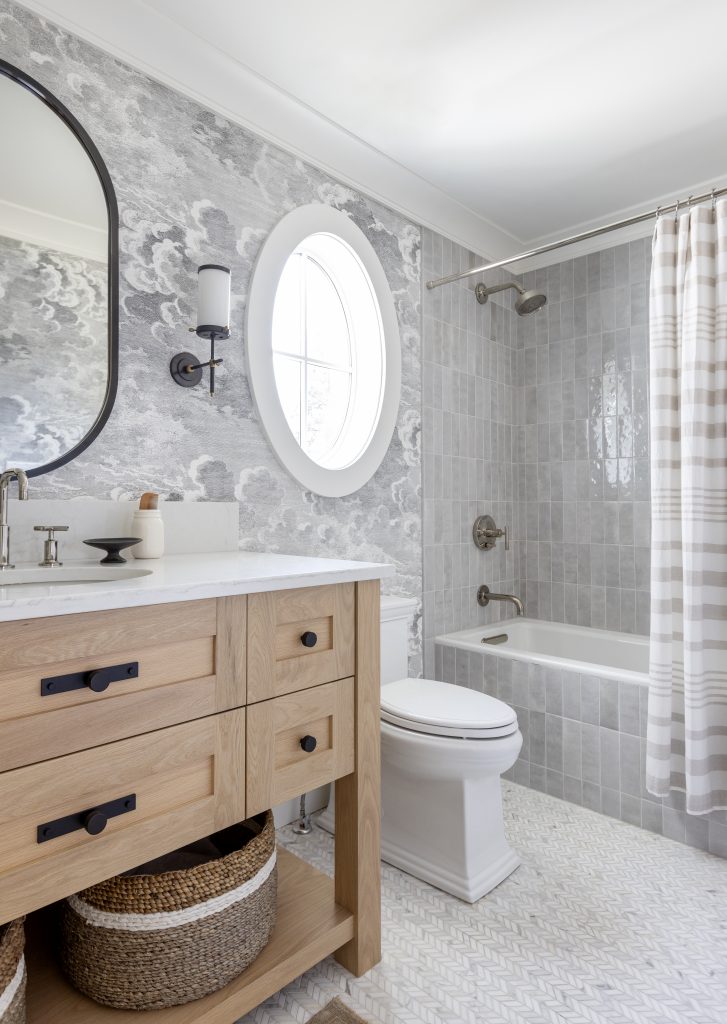
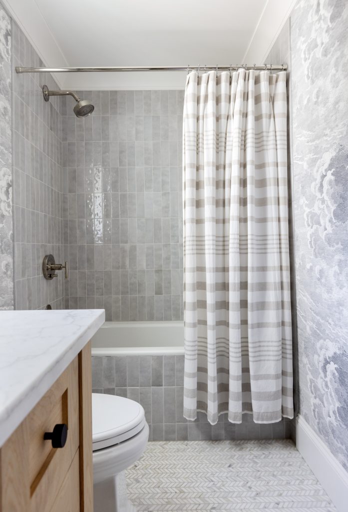
Because Liam’s room leads into a small bathroom, I wanted to marry the two rooms by playing off bolder elements and textures. The flooring is a mosaic herringbone marble, and we used a pretty handmade ceramic tile for a floor-to-ceiling bathtub and shower wall.
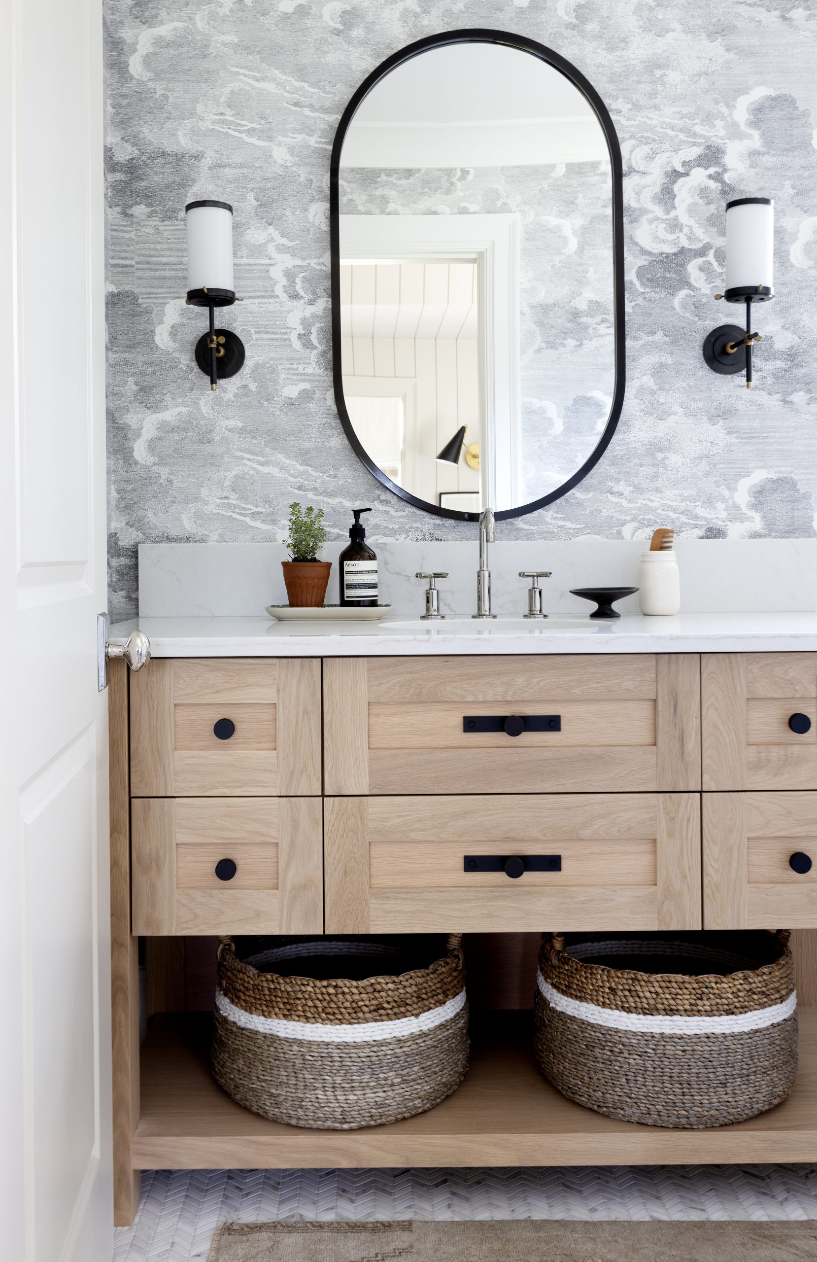
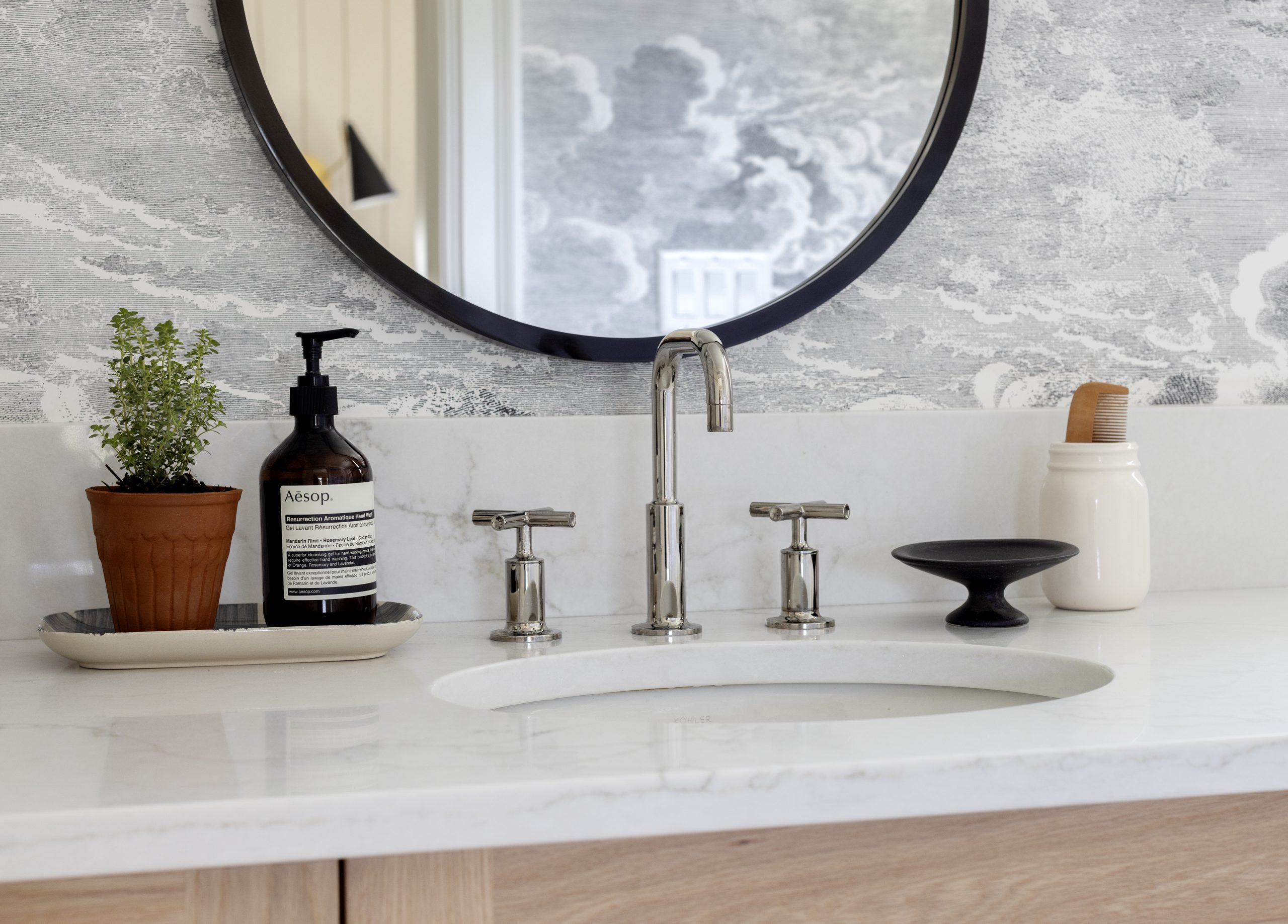
The vanity is made from white oak with matte black Armac Martin hardware. I added a few vintage elements such as sisal matt to have at his feat. The whimsical yet bold cloud wallpaper (a favourite of mine!) offsets the black accents and brings a sense of playfulness too, as well as plays off perfectly with his new room colour.

I know I say this often, but seriously, this might actually be my new favourite room in the house! There are a lot of incredible textures and tones that all came together so well. And most importantly I’m thrilled that Liam loves it too! Below are some before photos to show you the transformation!
Thank you to Sherwin-Williams for sponsoring this post, all opinions and views are my own.
Photography: Janice Nicolay
Room Design with: Stephanie Jean Design
___________________________________________________________________________________________
Sources
Paint: Accessible Beige SW 7036 in SuperPaint® with Air Purifying Technology from the Sherwin-Williams Living Well™ collection
Flooring: Divine Flooring
Bench and Wood Shelving: Custom made by ESQ Design
Wall Sconce Light: Monika Hibbs Home
Flush Mount Light: Monika Hibbs Home
Bed: Pease email [email protected] to inquire
Quilt: Monika Hibbs Home
Sheet Set: Monika Hibbs Home
Striped Throw: Monika Hibbs Home
Blue Throw: One Wednesday
Side Table: Monika Hibbs Home
Lamp: Monika Hibbs Home
Fern Artwork: Monika Hibbs Home
Landscape Artwork: Hannah Winters Art
Do Good Recklessly Flag: Monika Hibbs Home (this flag was custom framed please email [email protected] for more details)
Let The Good Times Roll Artwork: Minted
Be Brave Plaque: Magnolia
Picture Frames: Monika Hibbs Home
Rug: Monika Hibbs Home (shown on revised side in photos)
Wood Basket Ball Hoop: Monika Hibbs Home
Pouf: Monika Hibbs Home
Bed Accent Pillows: Danielle Oakey Shop
Bench Pillows: Brown Stripe, Blue Fern Stripe, Black Stripe
Bench Cushion: Window Works
Roman Window Treatments: Window Works
Bathroom
Cloud Wallpaper: Monika Hibbs Home
Mirror: Monika Hibbs Home
Bathroom Sconces: Monika Hibbs Home
Baskets: Monika Hibbs Home
Bathroom Accessories: Monika Hibbs Home
Plumbing Fixtures & Toilet: Kohler
Floor Tile: Bedrosians Tile
Shower Tile: Bedrosians Tile
Custom Vanity: Oldworld Custom Cabinetry
Hardware: Monika Hibbs Home
