Not A Kitchen Tour. Tour.
Let’s not call this a Kitchen tour quite yet okay? Simply because it’s just not that ready yet. Remember when your mom used to say, “no peeking” till it was done? That’s kind of the same thing here, our kitchen isn’t really ready yet, but the difference is I’m giving you a peek! I really am so excited to start sharing all the little details with you, so lets get started!
Also, what’s not ready you may ask? WelI… I just ordered our island stools which was so hard this time around. I think it took me over a year to finally decide on them. They won’t be delivered for another few weeks or so. We don’t have our window coverings yet and the gorgeous glass pantry which will be on the opposite side of the range wall still needs to be built… and a handful of little things that I still would like to check off my list. That all being said most of it has really come together beautifully and I’m truly excited about it. I’m sharing lots of the details you’ve all been asking about including paint colors, lighting, flooring and hardware. You’ll find all those details below.
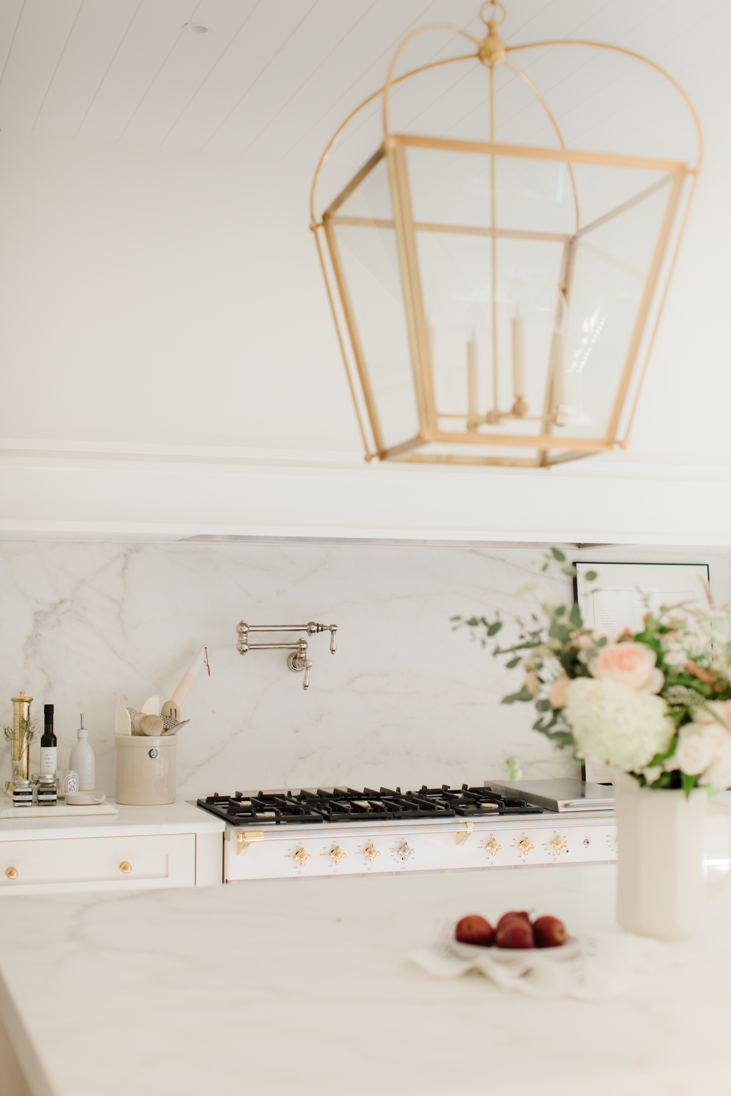
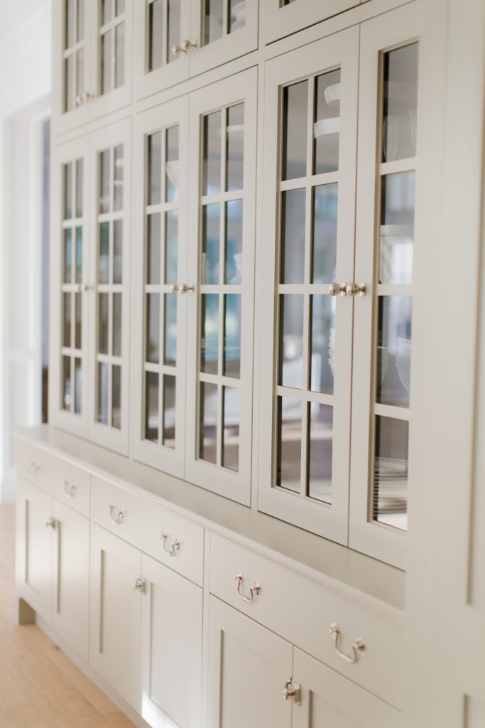
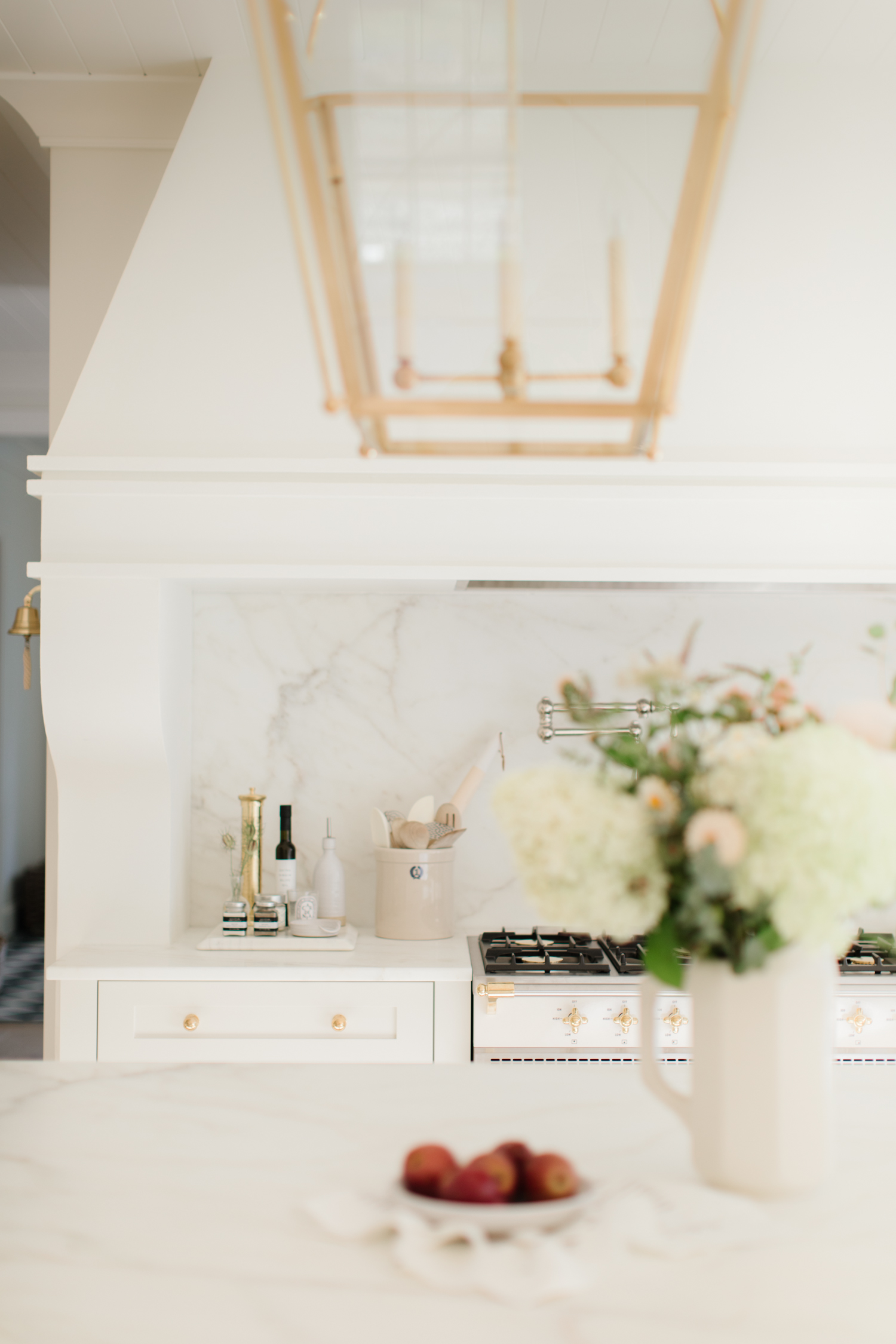
I won’t get into too much when it comes to the kitchen design, as I’ll wait to share those elements in the final kitchen reveal. However, you’ll notice that our kitchen layout it similar to our last house. The stove/ range is located in the centre of the kitchen, with the fridge to the right and sink wall to the left looking out the windows into the back yard. I just loved the layout and flow in our last kitchen and knew I wanted to do something similar. You’ll notice the main difference is the side of the hood and range space, I liked the idea of eliminating the upper cabinets beside the hood fan to allow for more food prep space. I didn’t want to lose the storage though so we did a full height wall of glass cabinets on the left side of the kitchen. It adds a beautiful, traditional look with storage and function.
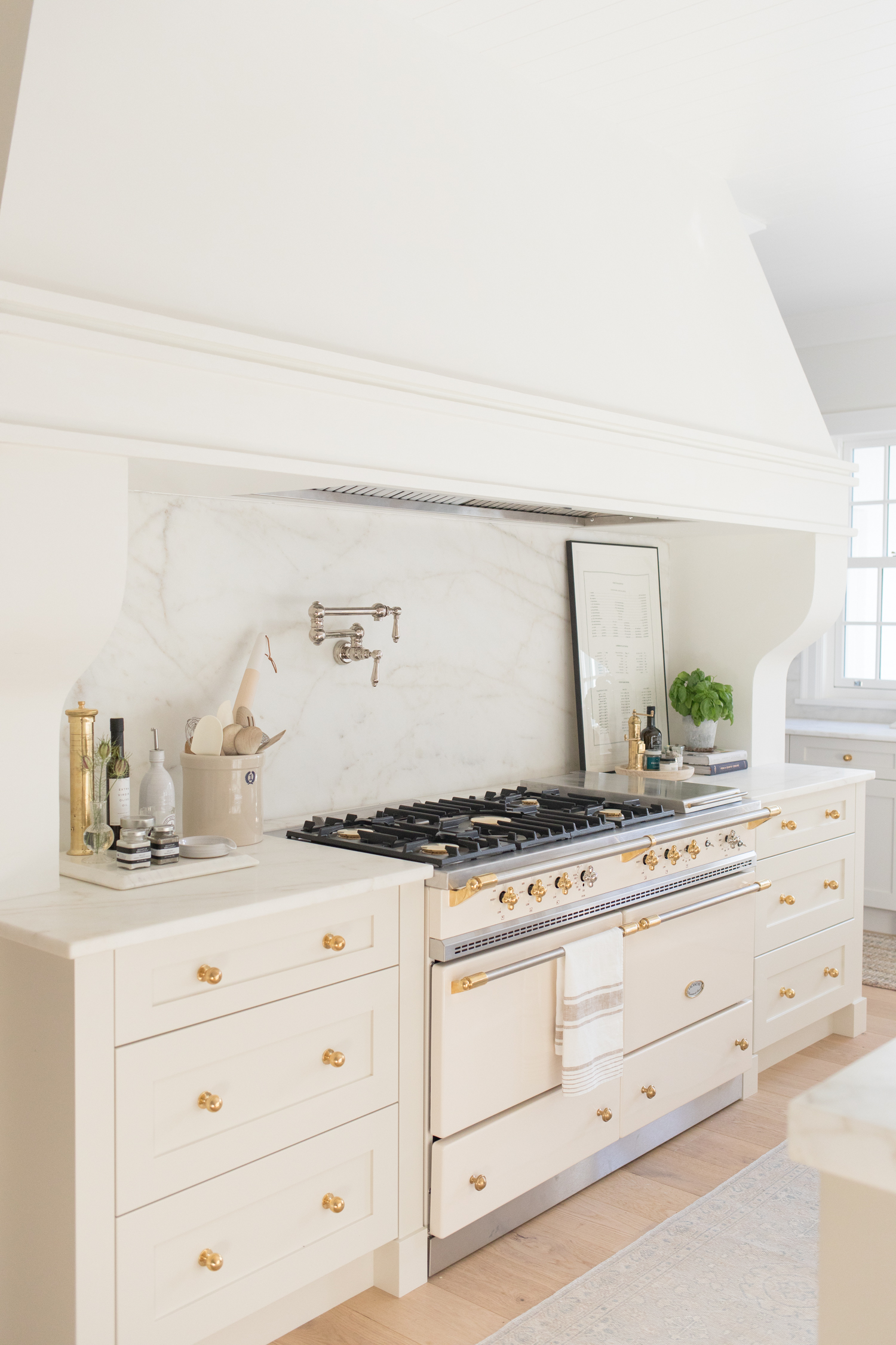
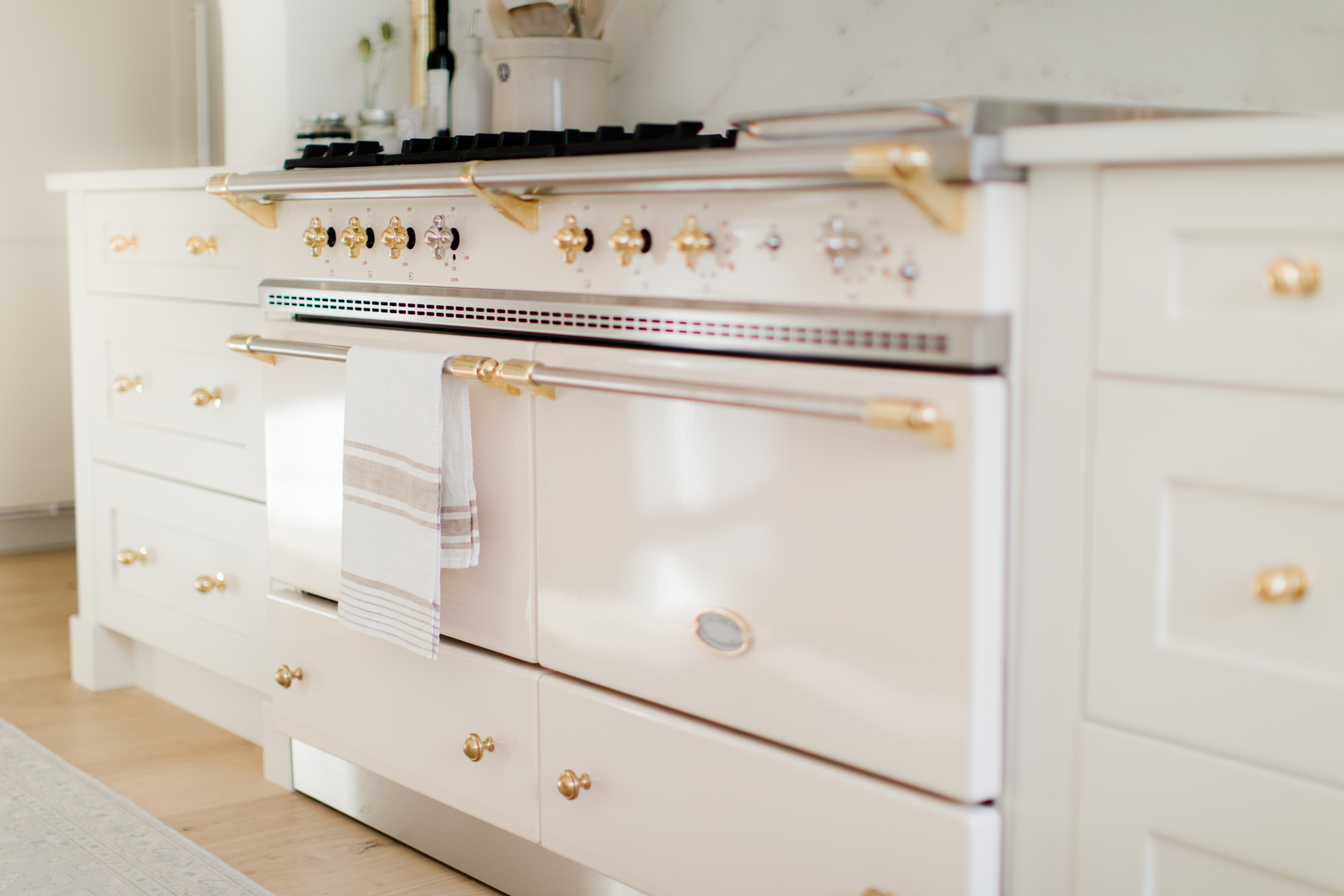
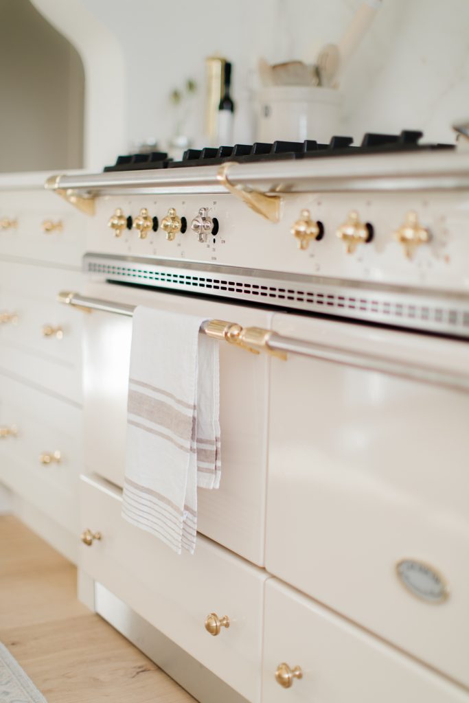
I’ve had my heart set on a Lacanche range for quite some time now. This range is made in France and is everything you’d expect it to be. Did you know the name Lacanche is from the Village in France where they build them? I would love to visit one day! Stephanie (Stephanie Jean Design) and I made sure to match the Ivory color to the cabinet paint as accurate as we could to allow for a cohesive look. It is the focal point of the kitchen. We worked hours on this range wall; size, proportions, shape, colors… and now with it all being complete we are obsessed.
Troy and I are also so proud to announce that through The French Barn, Monika Hibbs Home now offers the full collection of ranges to anyone interested. And the best part is that we’ll be providing an exclusive and tailored experience for to explore the collection of Ranges in The Grace Barn. This will be by appointment and available in 2021. For now, our team will help you (via email and phone) choose all the details. If you would like to learn more please visit our MH Mercantile section on monikahibbshome.ca
I really love that you con configure your stove to work best for your cooking needs. We chose the Sully 55″ range in Ivory + brass finishes – one gas and one convection electric oven. Including five burners (classic three burners + 2 – 15000 BTU burners) and an electric plancha (perfect for endless morning pancakes) on the far right.
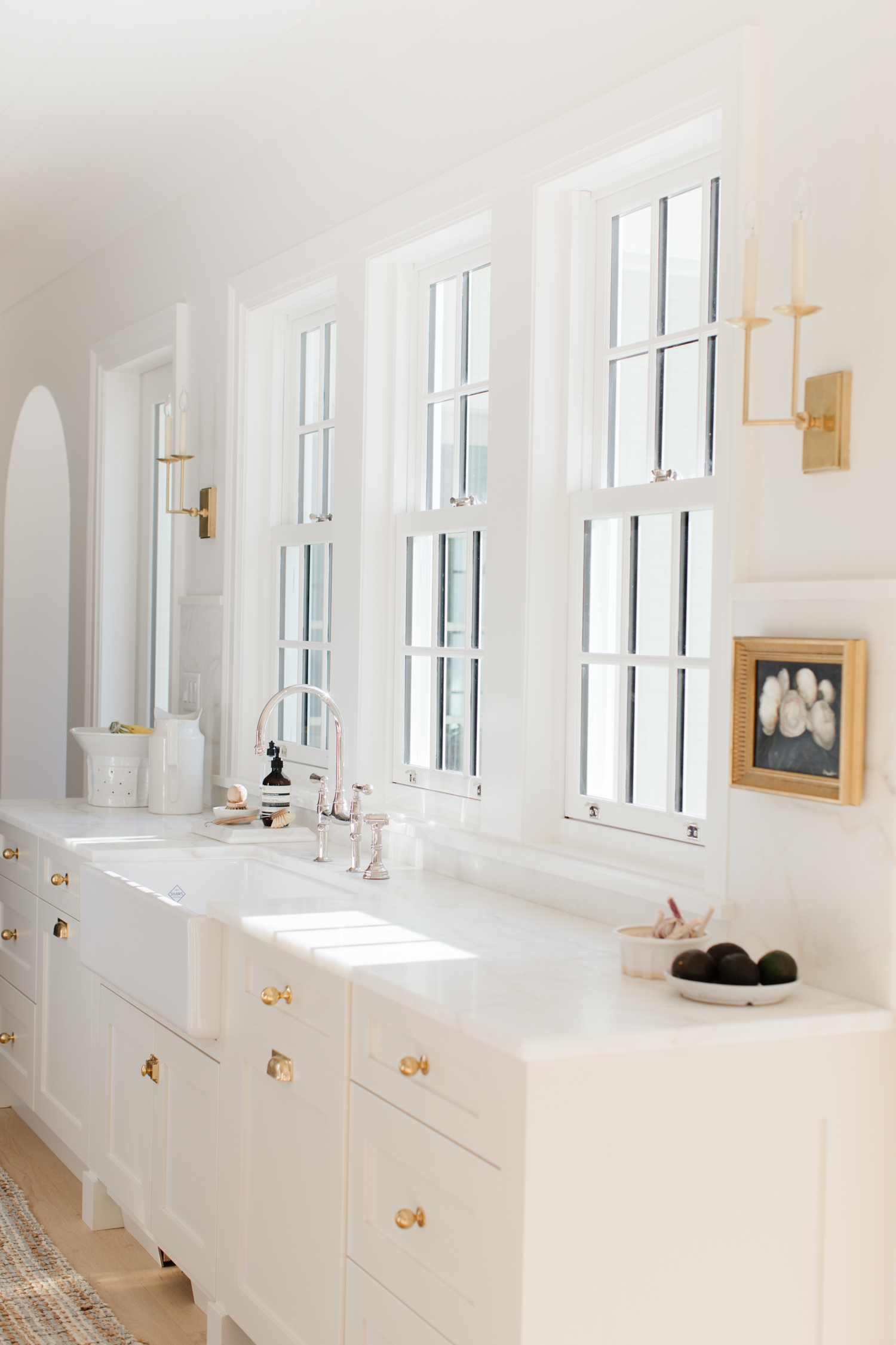
You’ll notice that I mixed metals in our kitchen. (You’ll see that a lot in our new house.) I love both a polished nickel and un-lacquered brass finish, so I used both! Since our range has both nickel and brass details we thought this was a great way to lead the two differences to the rest of the kitchen. I was hesitant at first but I love how it turned out.
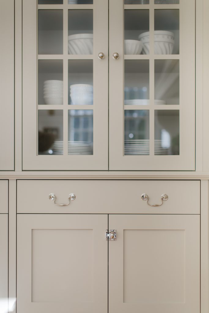
Island & Cabinet wall: Polished Nickel hardware
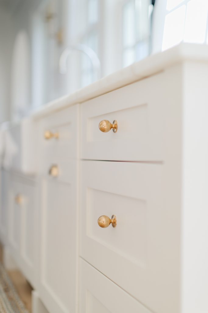
Sink Cabinets & Range wall: Un-lacquered brass
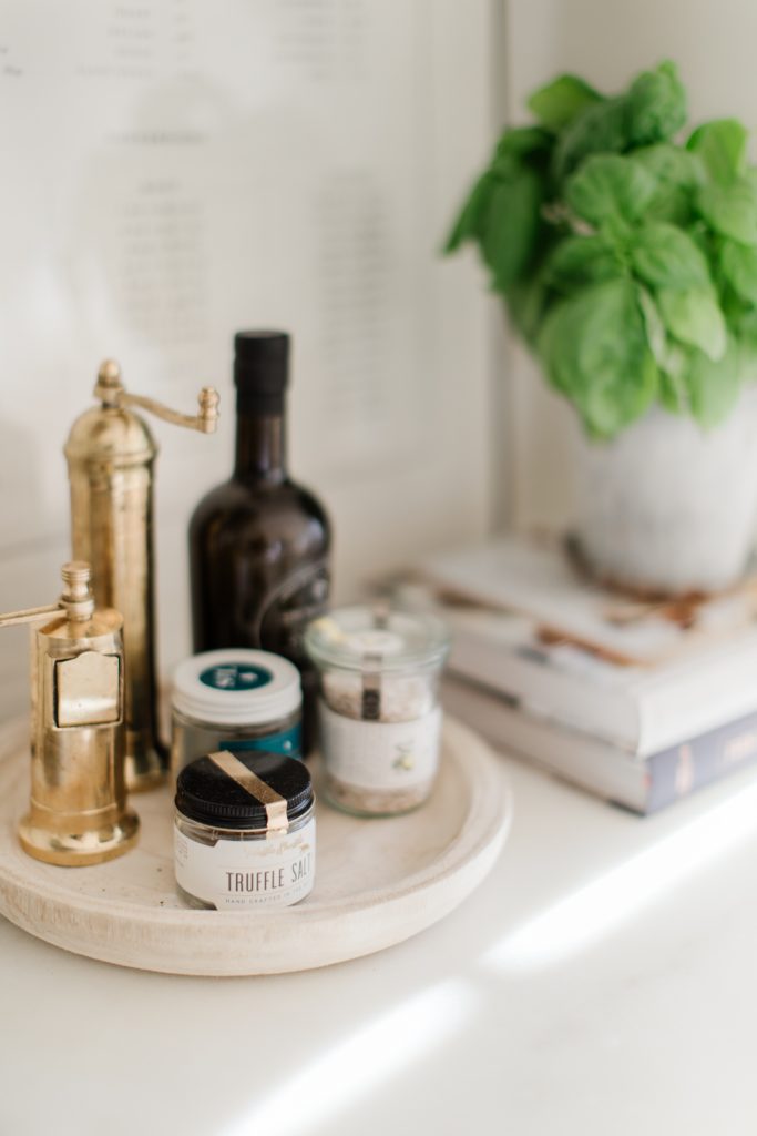
Salt & Pepper Grinders
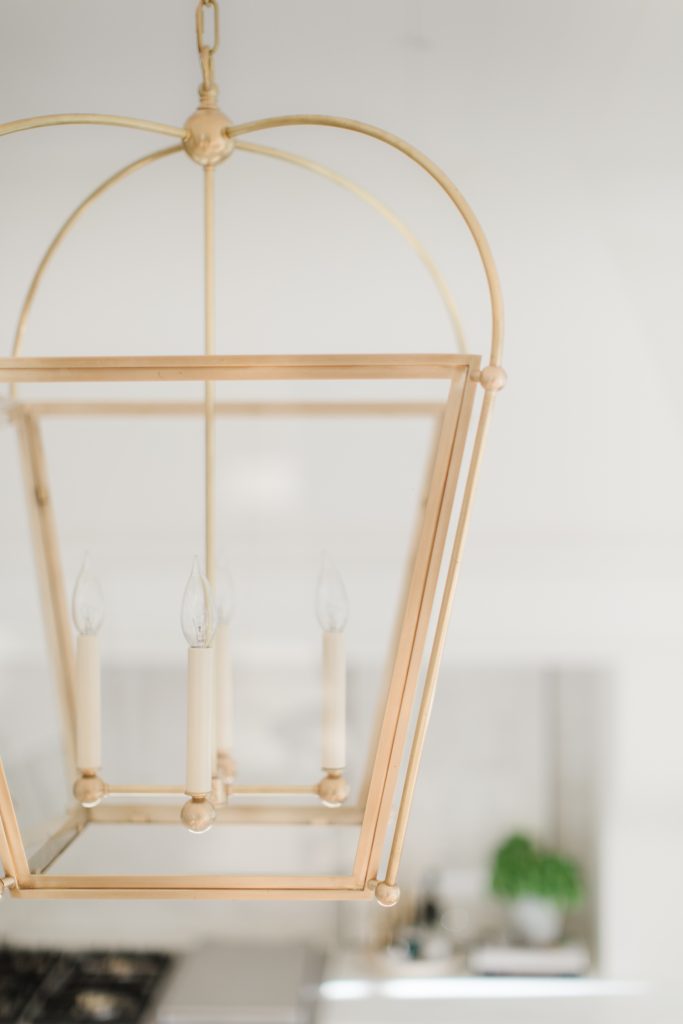
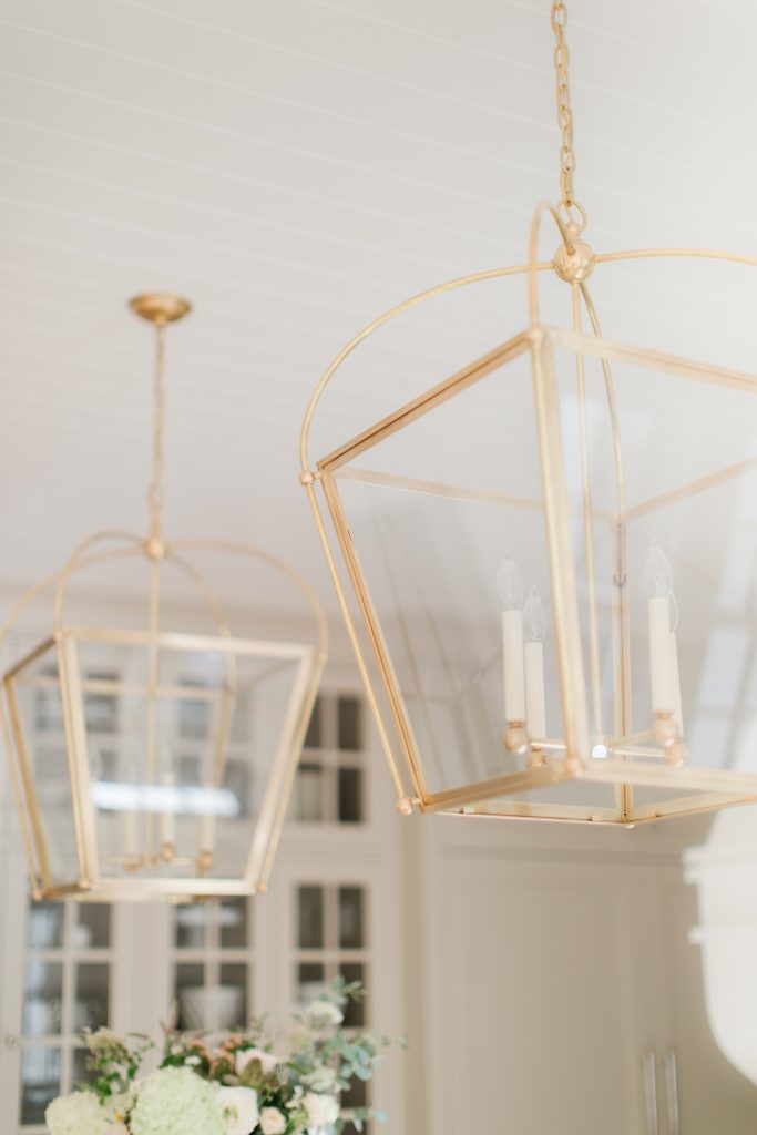
Brass Lanterns- medium
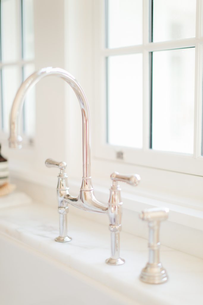
Kitchen Faucet in Polished Nickel by House of Rohl.
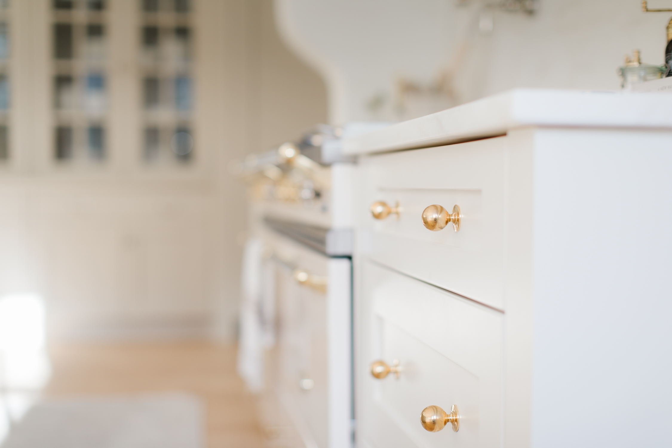
Knobs in Un-lacquered Brass by Armac Martin
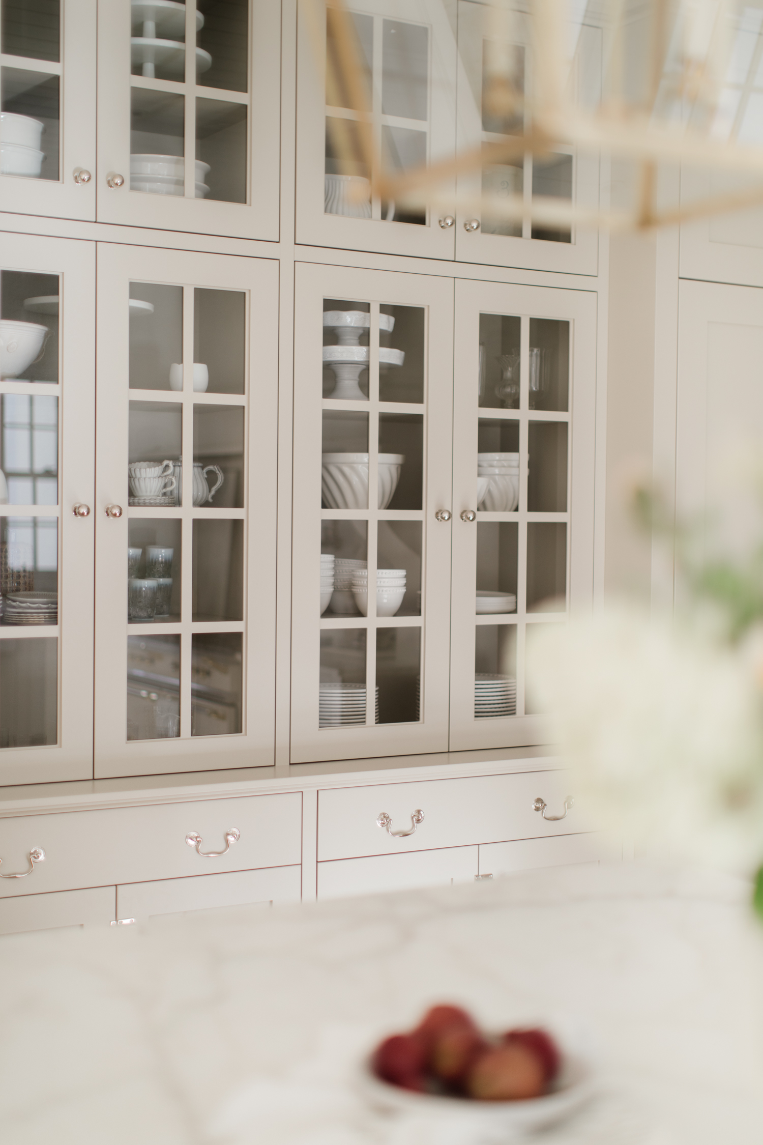
Knobs, Pulls and Latches in Polished Nickel by Armac Martin
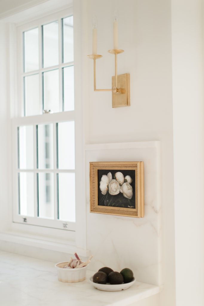
Custom Oil Painting by Diana Brambila
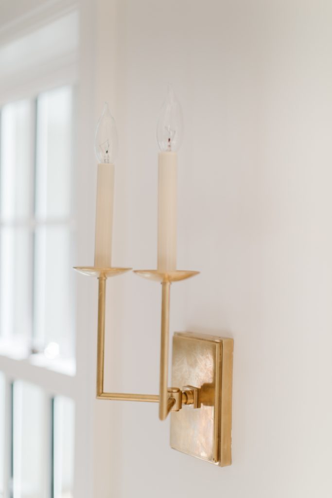
Right Angle Sconces in Brass.
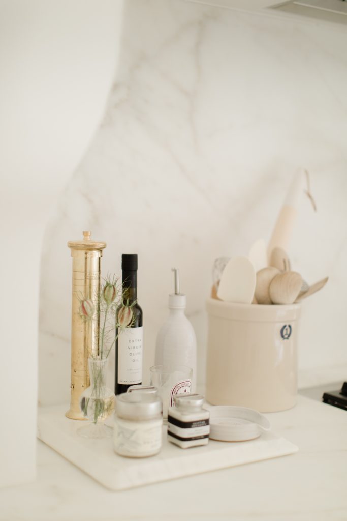
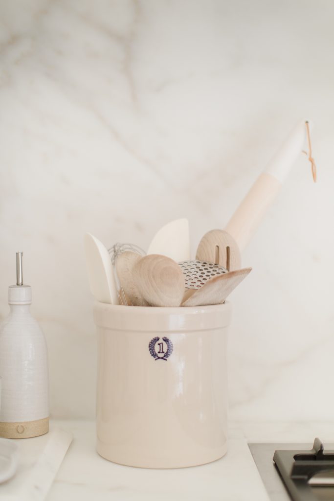
Ceramic Crock– perfect to house all your every day kitchen tools.
Paint Colors
Range & Sink cabinets: Strand of Pearls by Benjamin Moore
Island & glass cabinet wall: Stony Ground by Farrow & Ball
Walls: Half strength White Dove by Benjamin Moore
Trim, crown and shiplap: Simply White by Benjamin Moore
Kitchen Cabinetry by Old World Kitchens & Custom Cabinetry
Plaster Hood design & construction by ESQ Design
Cabinetry Hardware: Armac Martin
Hardwood Floors: Diving Flooring: Cosmopolitan Naked
Kitchen Faucet & Pot Filler (Polished Nickel): House of Rohl
Kitchen Sink: 36″ Shaws England- House of Rohl
For inquires email Rebecca at Ensuite: [email protected]
Counters: Marble (Bianco Ivy) Fabricated by Black Pearl
Range: Lacanche Sully 55″
Kitchen Accessories: MH Home Store
Lighting: MH Home Store
Vintage Runner MH Home Store
Interior Design: Stephanie Jean Design
Architectural Design: Su Casa Design
Builder: Matt Jesson Norcon Group
