Paint Colours to Know & Love
Paint! “What paint colour is that?” is one of our most commonly asked questions from all you home interior lovers. I know, it can be one of the most daunting choices to make while renovating, building or just wanting a fresh painted space. Thanks to our friends at Sherwin-Williams, we’ve created this post to help you navigate your paint questions for any project you might be working on. We’ve used Sherwin-Williams paint in our home in a variety of areas including walls, cabinetry, paneling, and our barn! In this post, I’ll show you the tried-and-true colours we’ve used with some of my favourite on-trend palettes to help inspire you and let you have fun with your next paint project.
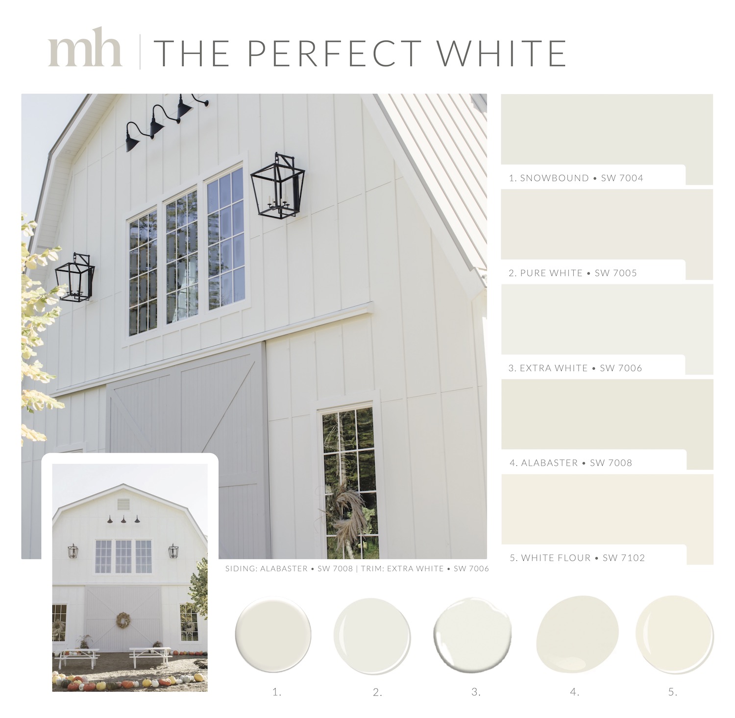
A fresh coat of white paint is one amazing way to refresh a space. It makes every room feel bigger, and continues to be popular in design. We painted our barn’s siding Alabaster SW 7008 and the trim in Extra White SW 7006. Alabaster is not a stark white; it has a little bit of warmth to it, almost a touch of creaminess that works perfectly for the exterior of a white house. I went with more of a true white for the trim for a brighter contrast. This created a really good marriage between the two, letting the trim stand out against the softness of the Alabaster. Similar whites that I love are Snowbound SW 7004, Pure White SW 7005, and White Flour SW 7102 for a warm neutral.
When choosing whites for your home, I prefer avoiding overly cool tones. You can use crisp whites for your trim, ceiling, or mouldings, but in terms of your walls, look for warm undertones to ensure your space feels inviting instead of cold. Keep in mind that whites can look different depending on lighting. I recommend grabbing 3-5 samples you love and painting your walls to see how each colour will look with your flooring and lighting. Sherwin-Williams has great peel & stick samples in their most popular white colours that you can try!
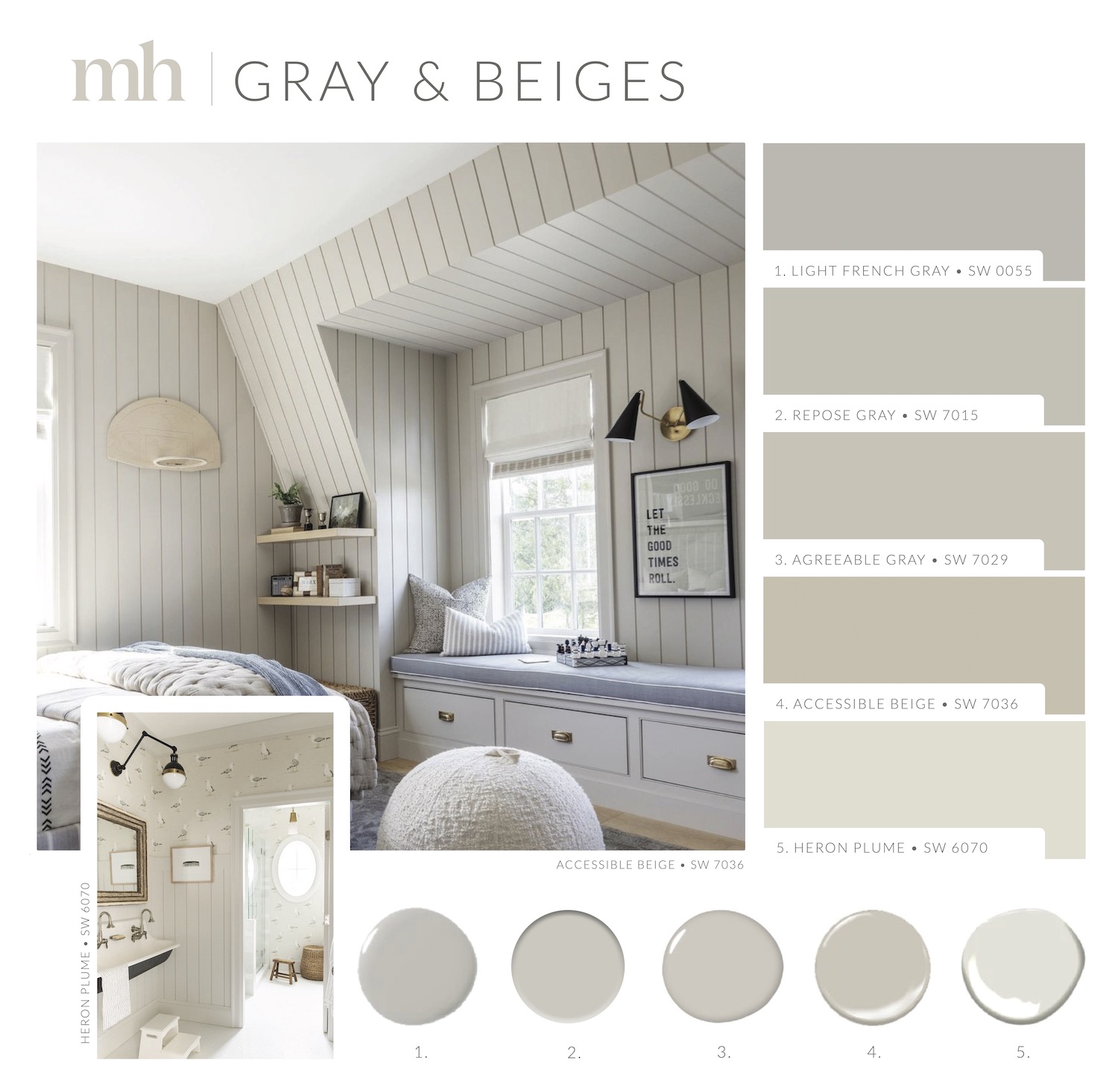
Beiges and grays are incredibly versatile colours when it comes to design. You’ve probably heard of the wildly popular “greige” hue by now, and I’m still in love with this chic blend of gray and beige. These colours feel fresh and inviting without being too dark, especially if you’re painting out a whole bedroom. Liam’s bedroom is a great example of this. I used Accessible Beige SW 7036, a really calming and earthy beige that Liam loves. In addition to the walls, we also painted the paneling and window seat the same colour. It hides fingerprints and any little marks well, making it an ideal choice for cabinetry and bare walls.
For the seagull bathroom, I chose Heron Plume SW 6070. I wanted a colour to match the playful wallpaper, and Heron Plume complements it so nicely with a hint of gray, a hint of beige, and just enough warmth for a statement colour without being too loud. When you already have a wallpaper in mind for your space, I recommend bringing the wallpaper sample to your neighborhood Sherwin-Williams store so you can get an accurate match to any of the colours you want to correspond with. You don’t have to match the base, but choosing a paint colour from an aspect of the wallpaper gives your room good cohesion, whether you’re focusing on a feature wall, or matching trim and mouldings. If you’re looking for fresh and inviting colours, I recommend Light French Gray SW 0055, Repose Gray SW 7015, and Agreeable Gray SW 7029.
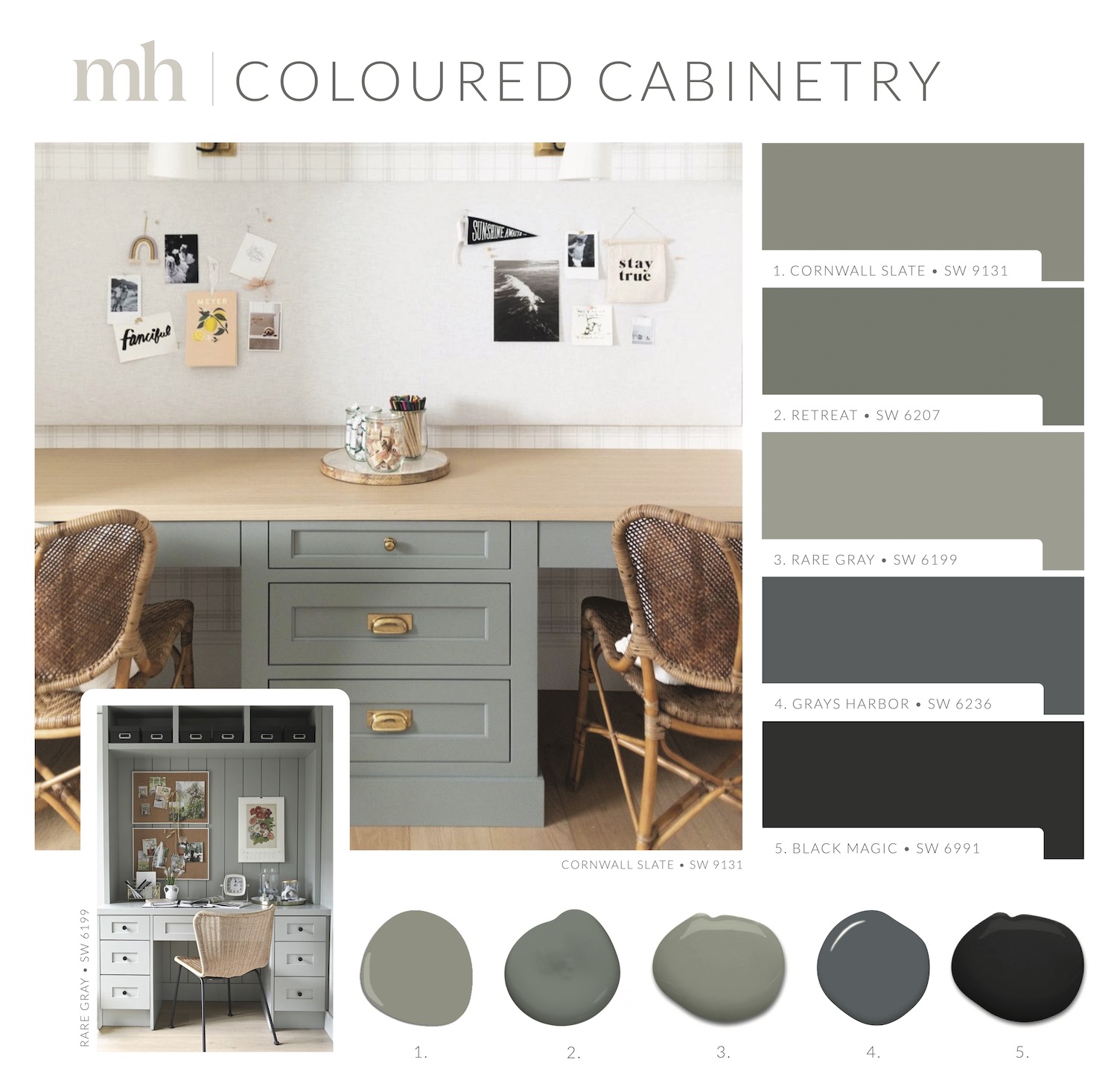
Coloured cabinetry is a recent (but not new) trend we’re seeing a lot of. From greens and blues to blacks, they’re everywhere! If you’re not ready to fully commit to bold walls, adding colour to your cabinets is an easy way to get a splash of colour in your space. In the desk area of our kids’ homework room, we’ve used a beautiful, muted wintry green called Cornwall Slate SW 9131. I truly can’t get enough of this colour. It hides any kind of wear and tear, and it’s a soft, soothing tone that matches well with our hardwood floors. It also looks great with natural design elements like baskets or cane chairs.
A second desk area I want to highlight is designed by Stephanie Jean. Stephanie used Rare Gray SW 6199, a true gray with a touch of green to it. This is an excellent option for bringing depth to your space. Similar colours that would look incredible on furniture are Retreat SW 6207, Grays Harbor SW 6236 for its blue undertones, and Black Magic SW 6991 in either muted or high gloss. Beyond cabinetry, this palette is perfect for kitchen islands, mudroom lockers, desk spaces, or even a whole kitchen if you’re feeling bold. Get a few samples and try them out, and have fun with it! You can always start by repainting a dresser or a small project you thrifted.
A pillar in the design world, Sherwin-Williams creates gorgeous and high-quality paints. Make sure to visit your neighborhood Sherwin-Williams store – I like to browse and leave with a handful of samples for upcoming projects to have on hand. You never know when you’ll want to refresh your space or work on a fun project. Why not start with these paint colours above? I promise you won’t be disappointed.
Thank you to Sherwin-WIlliams for sponsoring the post. All opinions and views are my own.
Shop The Post