Picking the Perfect Paint Colour
Selecting the perfect paint colour can be so overwhelming. Even when you already know what colour you want to paint with. The tones of grays, whites or any colour of the rainbow for that matter can be so tricky. It really is all about the shade, how large your space is and if the space will be flooded with light, or a darker, smaller space. From cabinet colours, walls, front doors, and exterior trims; it can make you want to walk away from your project all together… myself included.
I decided to write this blog post because so many of you ask for paint colour tips all the time. You ask what my favourite whites are, what gray to use that’s not too green and not too blue. And of course, what the trending tones are for the season and year ahead. Let me guide you with my favourites: Whites, Grays, Blues and Beiges that I am also considering in our new house. We’ve provided you with paint swatches and my favourite inspiration photos for some examples of how these paint choices translate in a room. Hopefully this helps you choose the best paint selection for your home. We’ve also included free downloads for each colour that you can print out and take with you to the paint store, you’ll find a sample at the bottom of this post too. Once you have an idea of what you think will work in your space, I suggest having the paint store make you some sample cans. Take them home and paint a section of your wall, side by side is key. The lighting in the room, sizes of room always makes the colour look different too. What you thought was a gray might actually look more blue or green. Same goes for whites, maybe it’s looking too warm and you want to cool it down with a brighter white. I can’t recommend this enough, painting sample swatches in your space is so helpful. And wayyyyy better than having to re-paint a room!
 Primary photo: Monika Hibbs | Secondary photo: Joe Schmelzer
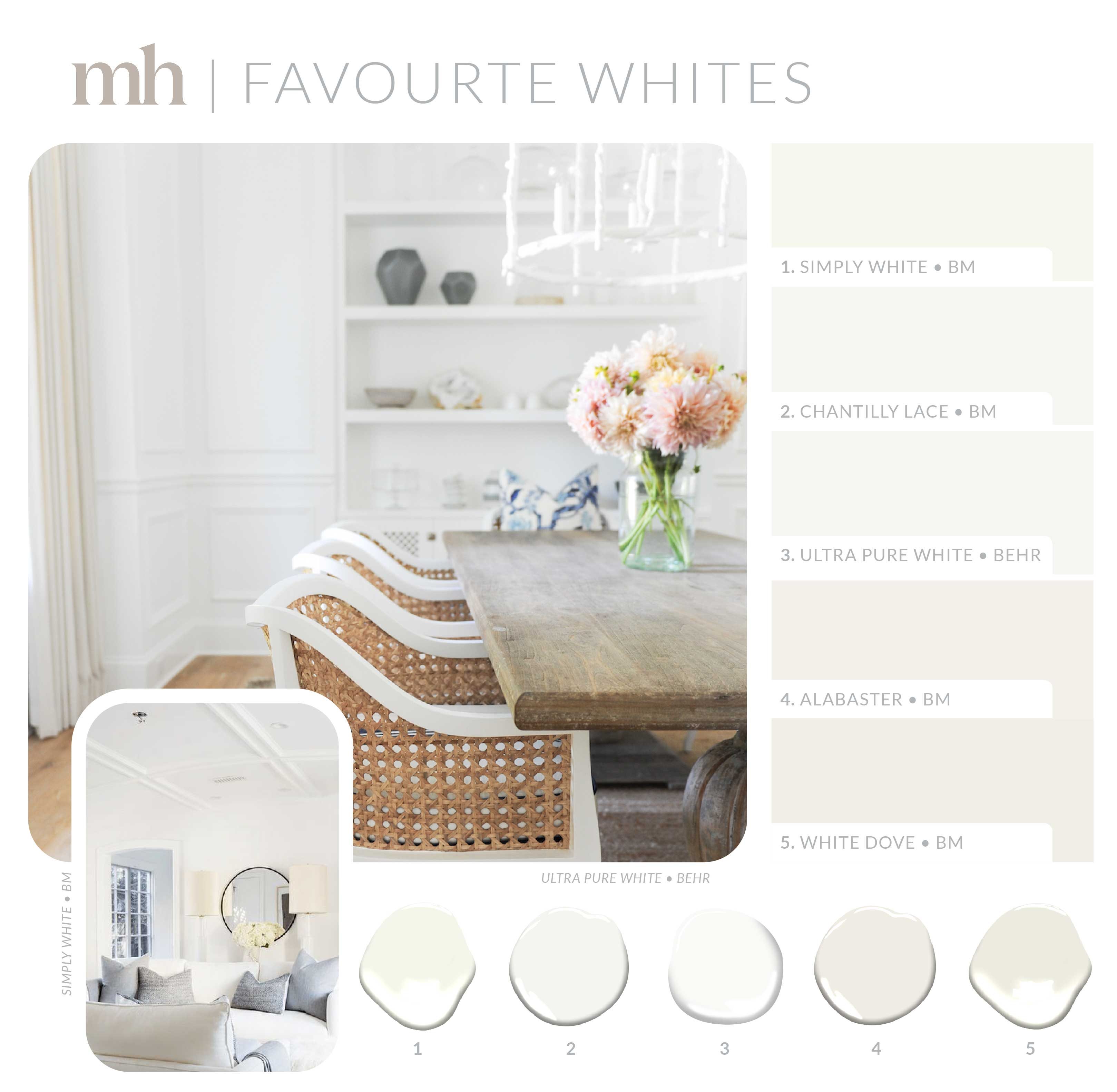
Let’s start with my starting point in my home. If you know me, then you know white paint is a must for every home, especially my own. I’ve used all these whites and love them. Simply White by Benjamin Moore is a great starting point. It’s a nice crisp clean white. If you’re looking for something with a little warmer tone try White Dove on your walls, and Simply White for your finishings and moldings. If you want the whitest white, I recommend Ultra Pure White by Berh, we used this in our last house on all the trim and finishings. You can see an example in the above photo of our dining room. Looking fo something in-between? Try Chantilly Lace and Alabaster by BM.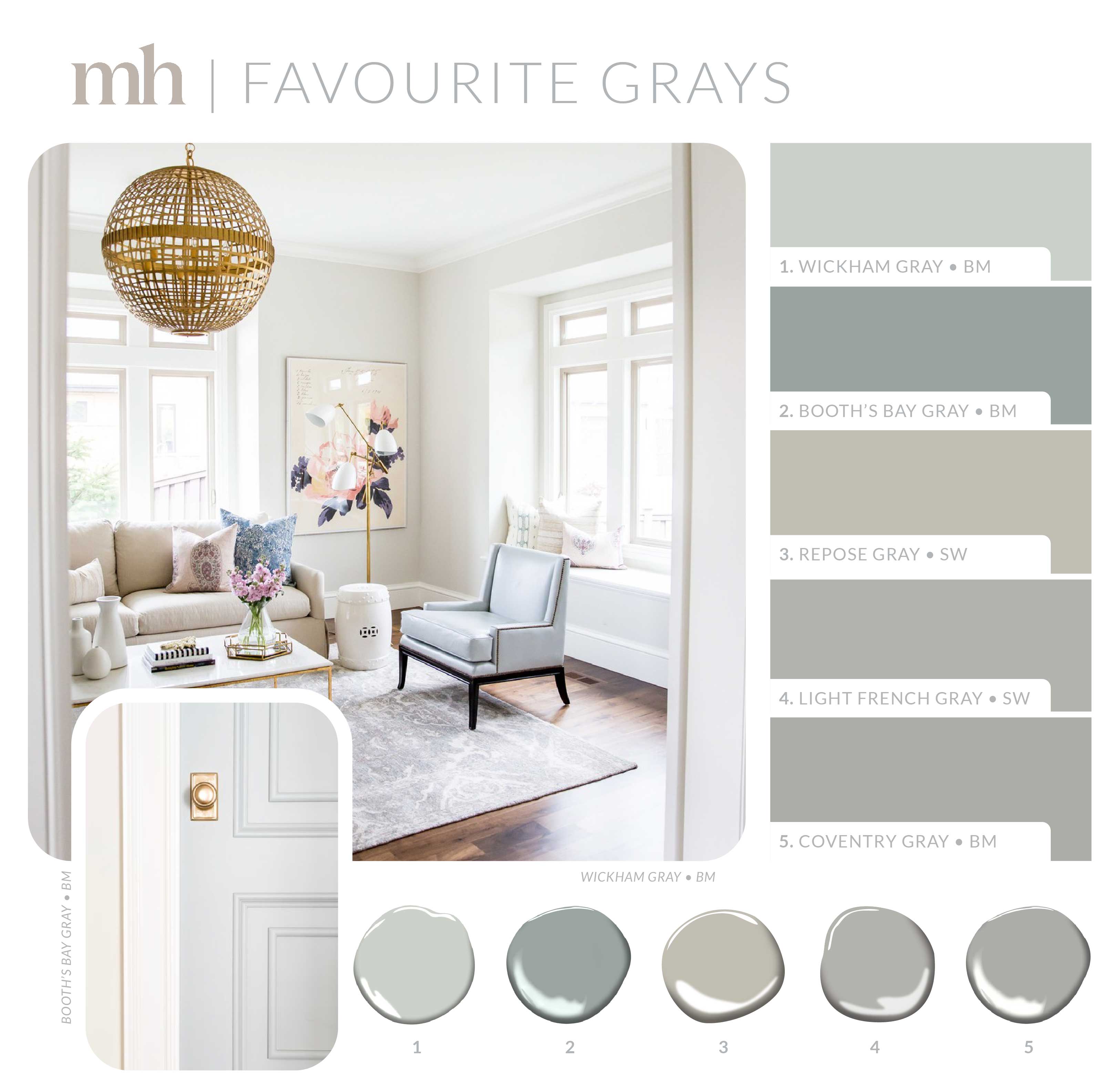
Primary photo: Studio McGee | Secondary photo: Rachel Parcell
Grays have been around for years and are always a safe bet. And for good reason, they’re gorgeous and add a little personality to any space. I also like to consider grays when whites are just not doing it for me. They can still be inviting and make a space look clean and bright. An example is the above photo using Wickham Gray, it’s a light enough gray that makes a room feel fresh without using a standard white option. I also love to use grays when making a statement. It’s great for feature doors, cabinets and built ins. You might remember my office in the last house (see photos in our home tour). Since I had a lot of white walls in our home, I thought the office would be a great space to branch out a bit. We used Coventry Grey by BM, which looks a lot darker in the swatch, again why I recommend testing it out before making a final decision. Booth’s Bay Gray is another great example of that. It’s much lighter when painted, you can see this in the above door photo. It’s one of my favourite statement grays right now. It has a beautiful blue french undertone to it, you can’t go wrong with it. Light French Gray is also a favourite of mine and looks great on doors and windows. (Our current MH office door is painted this color.)
 Primary photo: Cyndy Aldred | Secondary photo: Stephanie Gamble Interiors
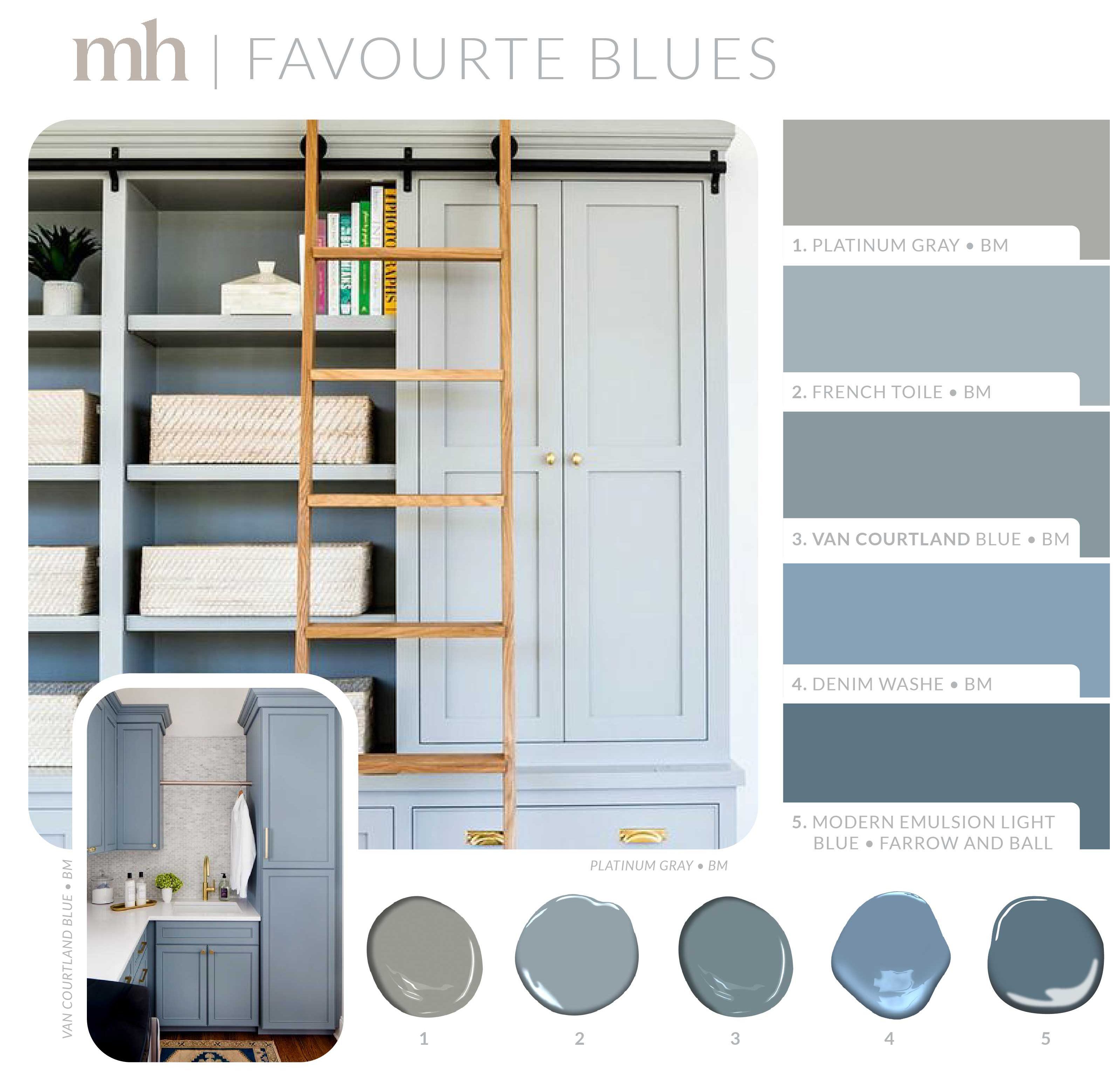
Believe it or not, blues are tricky!!! Mostly because they look so different once painted in different spaces. Some swatches say “gray” but definitely look more blue when painted- see the above cabinetry to agree! Currently, I’m loving blues for cabinets and doors. From light blues to dark navies, I say all are a safe bet. Think about spaces like your laundry, kitchens, media rooms, mudrooms, offices and front doors. I’m still trying to decide where I’ll be using some of these options in our new home, perhaps one of the boys’ washroom cabinets, how cute!!
 Primary photo: Catherine Romano | Secondary photo: Helen Parker
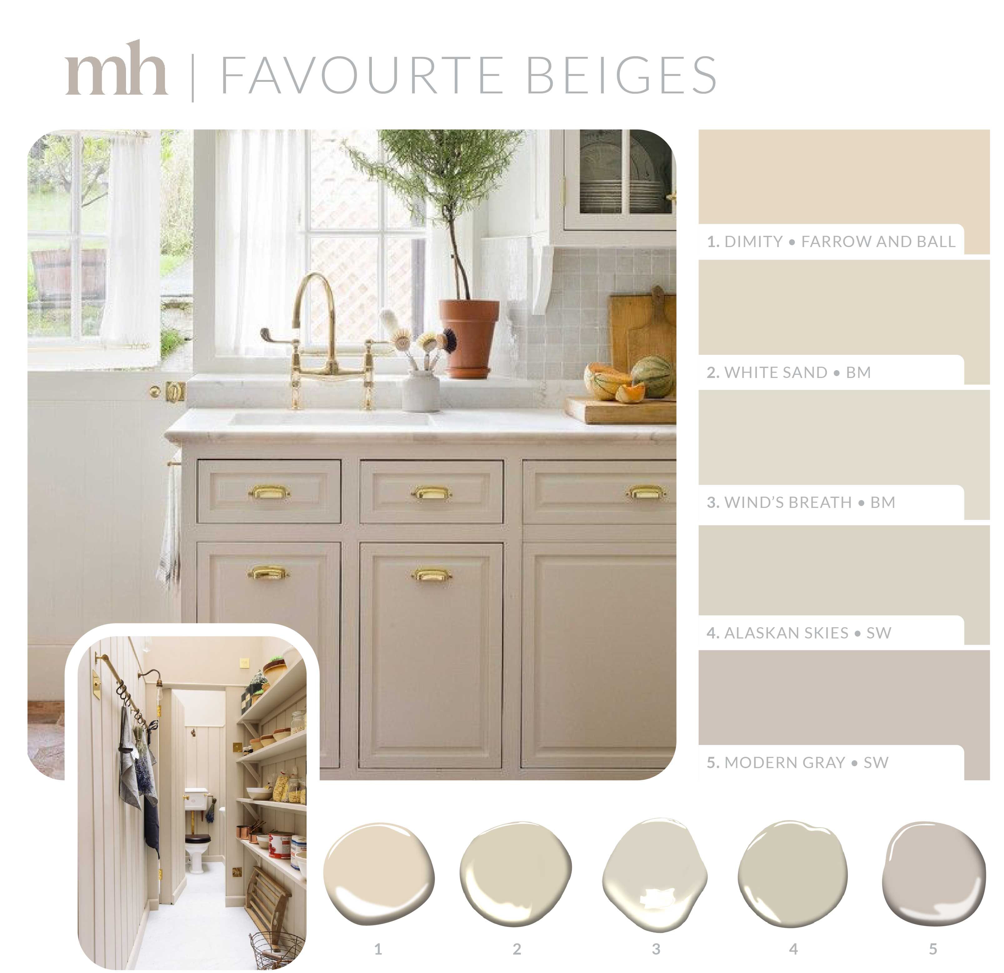
Let’s talk about the hottest trend when it comes to paint colours! You might have heart the term “greige” being thrown around in the design world. A little bit of grey with a little bit of beige, making the perfect paint colour, especially when it comes to cabinetry and finishings. My eye still tends to draw more to the beiges so let’s talk about the above colours. The cabinet photo above has been a huge inspiration for a secret project I’m currently working on. I wasn’t able to nail down the exact colour of paint but I’ve found some similar options with Benjamin Moore’s White Sand and Wind’s Breath, and Modern Gray by Sherwin Williams. I’ve been obsessing over these tones and cannot wait to decided where to use them in our new home. I’m thinking mudroom, or my mom’s kitchen. (She will have her own section in the house, I’m overly excited because I want to try some fun new design ideas… thinking more French/ English Country kind of feel.) If you want to try something new too, beiges are a great direction to go!
Print out the below printables for each paint colour, to help you make your painting decisions.
Download all Notecards + Paint Swatches here:
Shop The Post